


2026-09-17 13:05:56
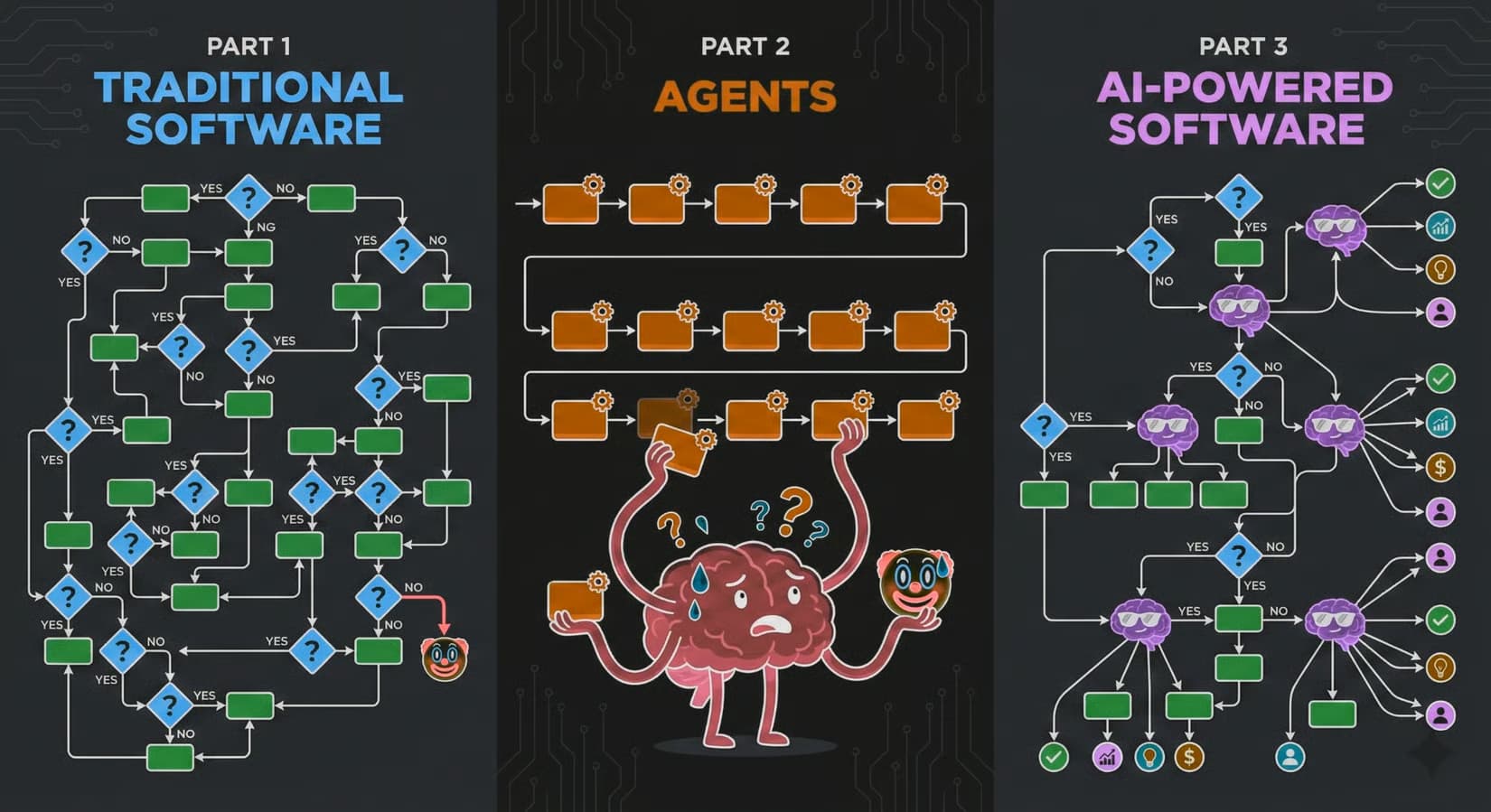
I am very excited about Jev. Typesafe.ai has something fresh, powerful, unique here. I'm mentally infactuated.
Attributes of Jev that stood out to me:
We get the tokenization LLM powers to breakdown input (token window) but without the word vomit. No hallucinations because it's not using probability to hopefully create a pleasing string.
It's exposing the intricate connections it made to the input data. To extract meaning from that super brain that just ingested your JSON, you ask it blunt questions in near natural language.
It's like a fast path to machine learning.
Where you used to need a ton of data and custom machine learning, then run that somewhere and have it probably be slow. Jev is fast, learns data patterns near instantly, and lets you ask questions and make decisions about it's processing of the data.

I don't know how many of those words will resonate with you.
But I urge you to sit down for more than an hour with this. Run through all the tutorials, watch a few of their videos and read the docs.
I think we're looking at a next-gen programming model.
Here is a playground I made to see what Jev thinks about agent assisted art and whether or not a human or an agent is actually the creative.
Comment out one of the stories so the dataset is lopsided, run it and observe the question scores. Then switch to the other story, run it, observe the scores.
This is powerful stuff.
System One has some really compelling examples, and of course I loved the Doom example.
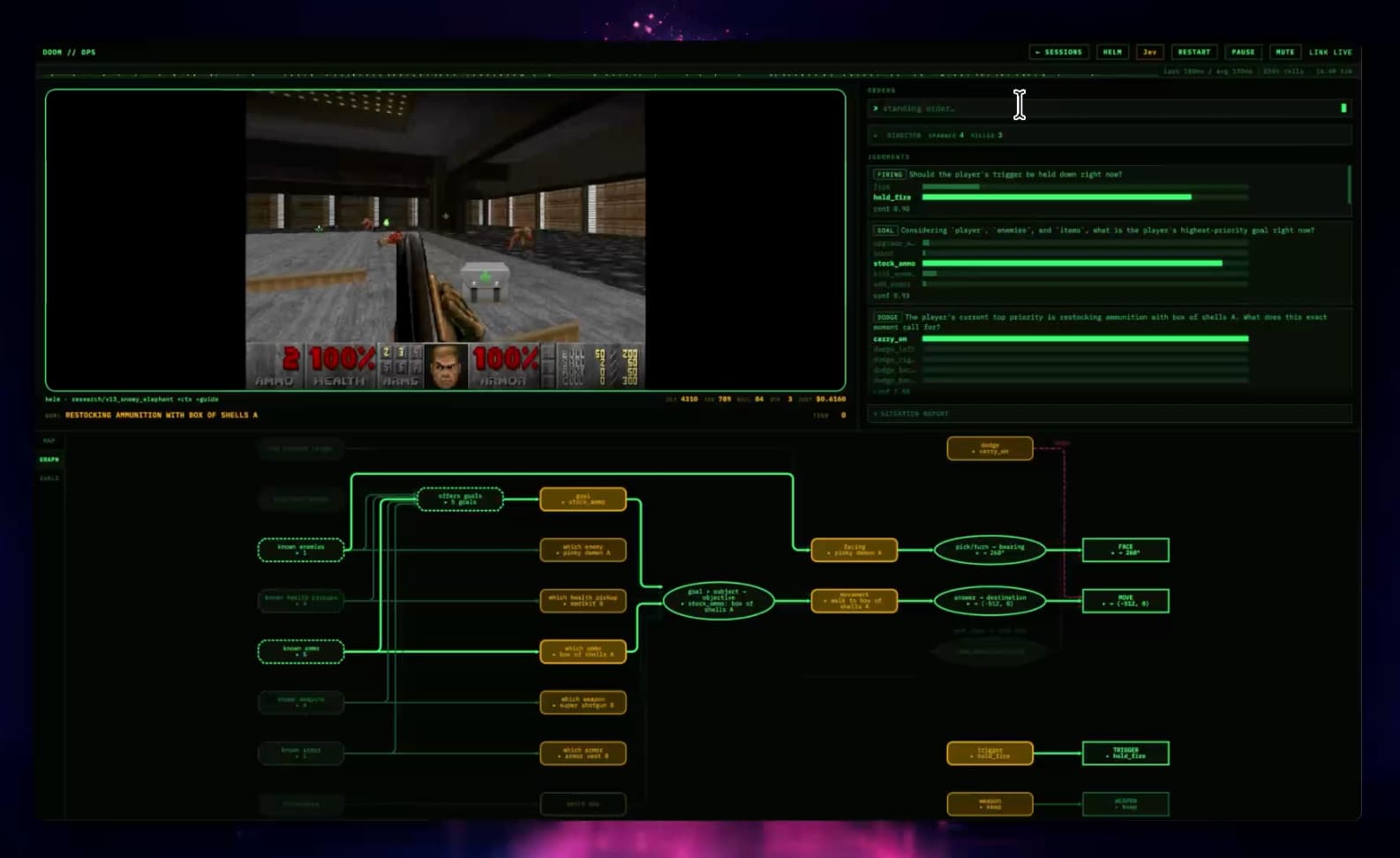
Since Jev is fast, it can process the game's structured data (enemies, room details, etc) and "make common sense judgements", AKA play the game damn good.
Q: Jev doesnt want to own the code, but does want to own narrow structured decisions… which shouldnt the right line of code be a narrow structured decision?
Seems to me like someone could make a Claude Code out of this.
Q: At first I felt the usages of Jev were limited, but I think we're looking at more of a programming model shift then some new tool?
It's fundementally making me think different about how I could write logic to create systems.
Q: What kind of apps does it unlock because it's so fast?
A lot of early use cases will be periodic queries, but if you can get intelligent judgements multiple times a second…
2026-09-11 01:51:24
Ep #253
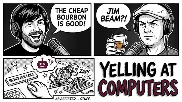
Experts Agree: Yelling at Computers Is the Future
Robbie and Chuck reunite over Jim Beam White Label to catch up on Chuck's move to Italy, AI as tech leads, CodeRabbit versus GPT for code review, SOC 2 compliance workarounds, and why GitHub bots might unlock dark factory workflows.
⤷ whiskey.fm · youtube · spotify · apple
2026-09-04 03:55:34
Did a deep dive to see if StyleX would work at Shopify.
Turned out to be a wash, similar to my other explorations into OOCSS.
2026-08-21 20:23:38
Ep #252
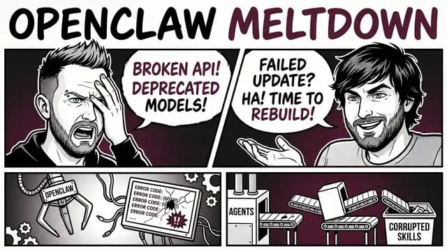
OpenClaw, Dark Factories, and Why You Should Stop Cussing at Your Agents
Robbie and I sip Compass Box Crimson Cask and get into the death of OpenClaw, factory engineering for AI workflows, npm worms targeting TanStack, sparse attention with SubQ, and why Ghostty is leaving GitHub.
⤷ whiskey.fm · youtube · spotify · apple
Presented by GitKraken
2026-08-19 01:24:04
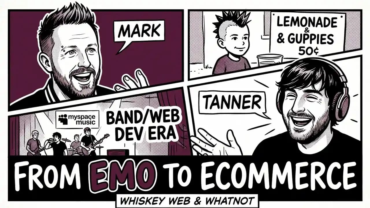
Ep #251
Guppy Pimpin In Trip Pants While Debugging IE5
Robbie and I do a mostly whatnot episode about our path getting into tech, playing in bands, and getting into trouble. We sip Glen Morangie "A Tale of Ice Cream" and share some stories.
⤷ whiskey.fm · youtube · spotify · apple
Presented by GitKraken