2026-06-14 04:13:33
macOS Golden Gate deserved a wallpaper inspired by its namesake.![]()
Apple announced the next version of macOS at its annual developers conference this past week, introducing macOS Golden Gate. But one thing was suspiciously absent from the beta: a wallpaper inspired by the operating system’s namesake. Instead, we got a much more muted, abstract grey-blue-taupe wallpaper designed to unify all the platforms. It’s fine enough, but a proper Golden Gate wallpaper it is not.
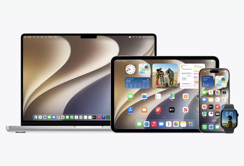
The new unified wallpaper of OS27 across Mac, iPadOS, and iOS.
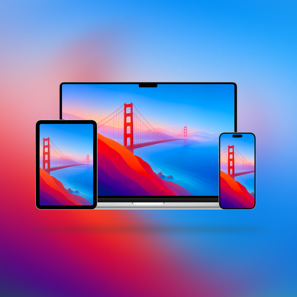
So I set out to right that wrong.
Using Apple’s previous California wallpapers as inspiration, I tried to generate something that felt like it belonged with the OS. What came back was a good start, but in usual AI fashion, the devil was in the details. The trusses were a mangled mess, the cables were hallucinated nonsense, and the longer I looked, the more oddities I found.
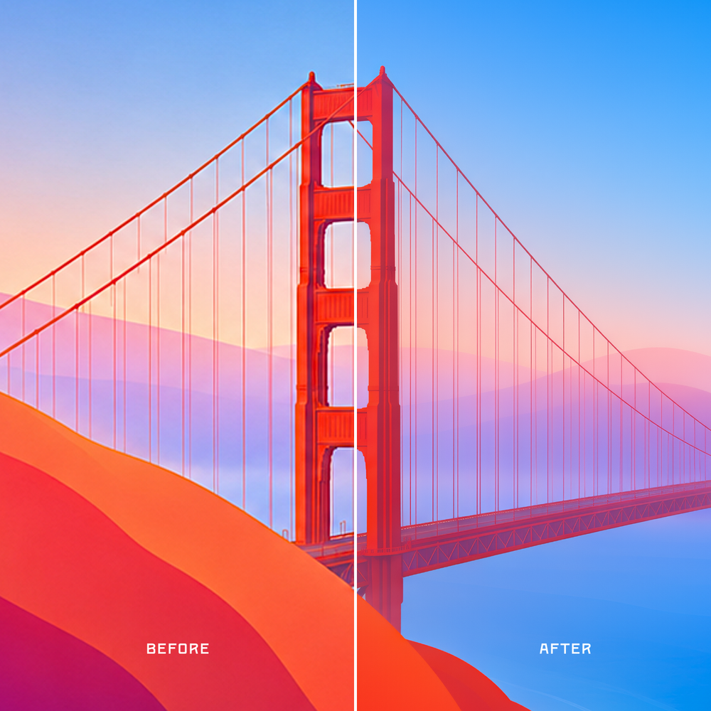
Left: the original generated image.
Right: the final version after upscaling, editing, denoising, and cleanup.
So I spent a bunch of time polishing it into something I felt comfortable sharing. That included various stages of upscaling, denoising, refining, colour editing, and more.
It may still be, as the kids say, AI slop. But it’s AI slop I spent a lot of time trying my hardest to make look as good as I possibly could. Enjoy.
2026-06-10 00:05:39
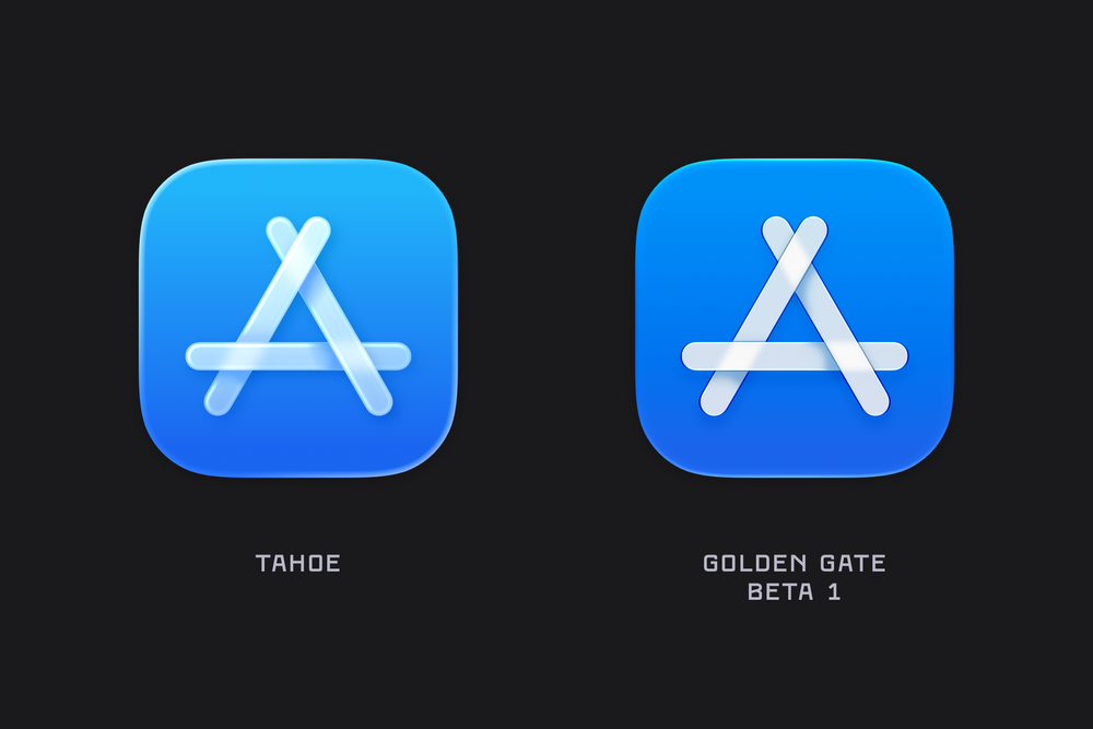
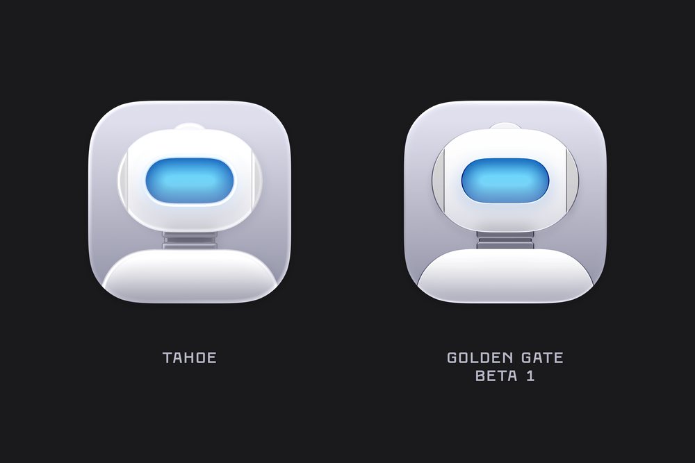
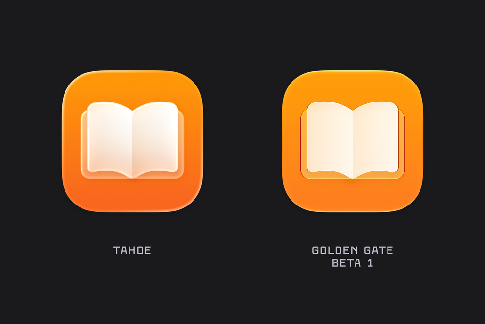
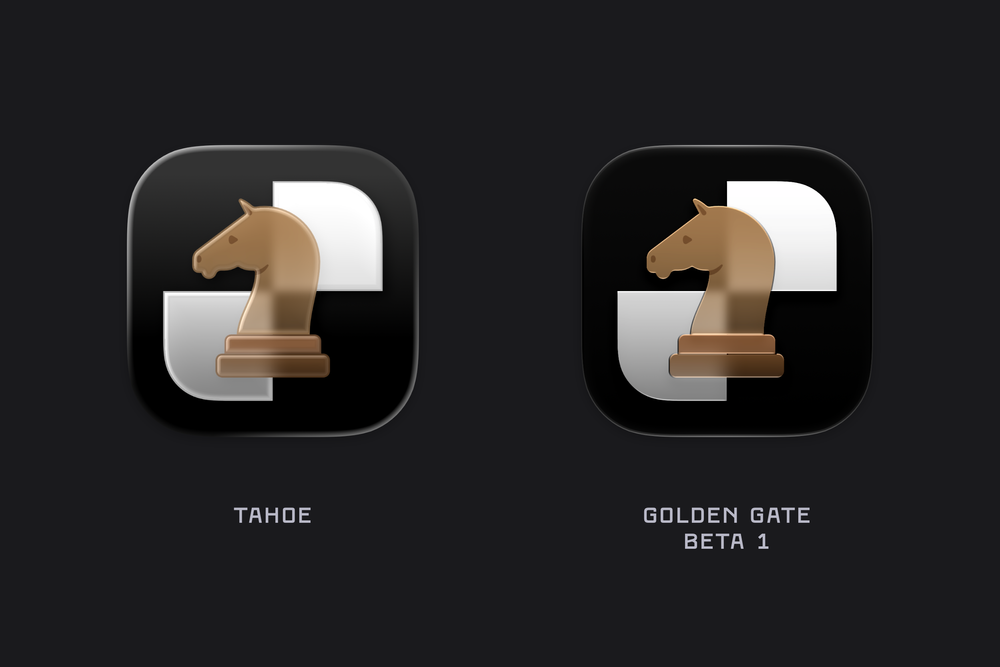
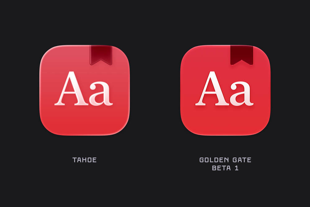
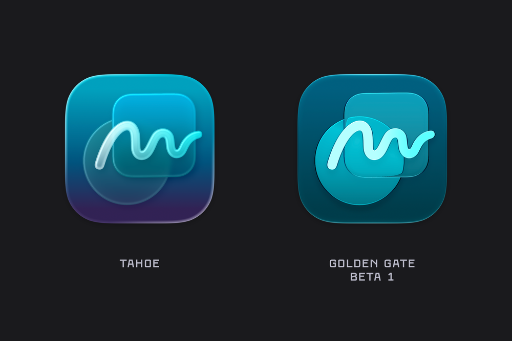
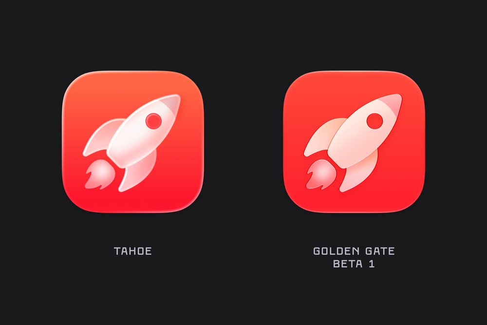
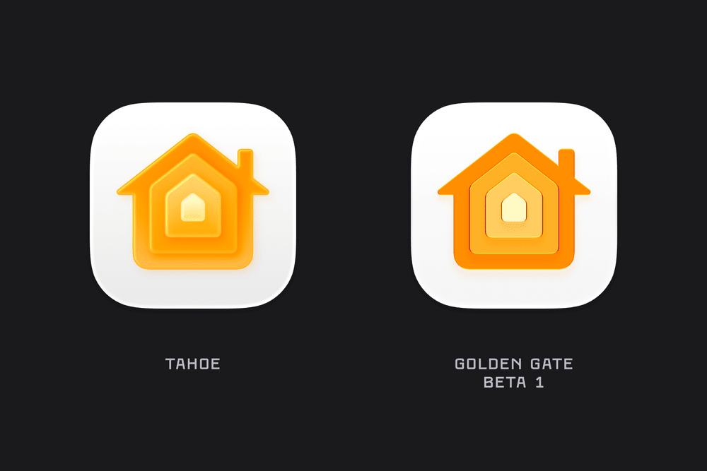
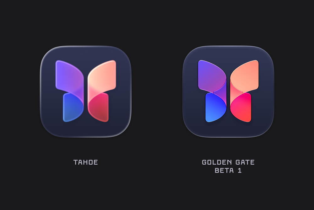
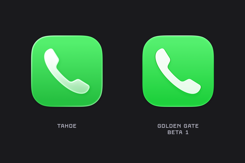
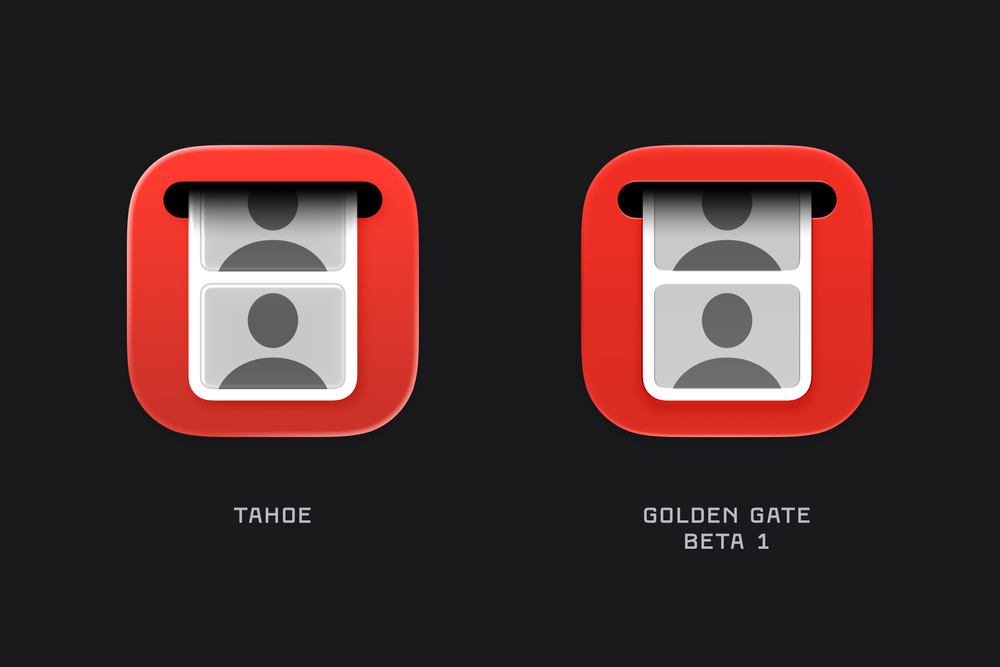
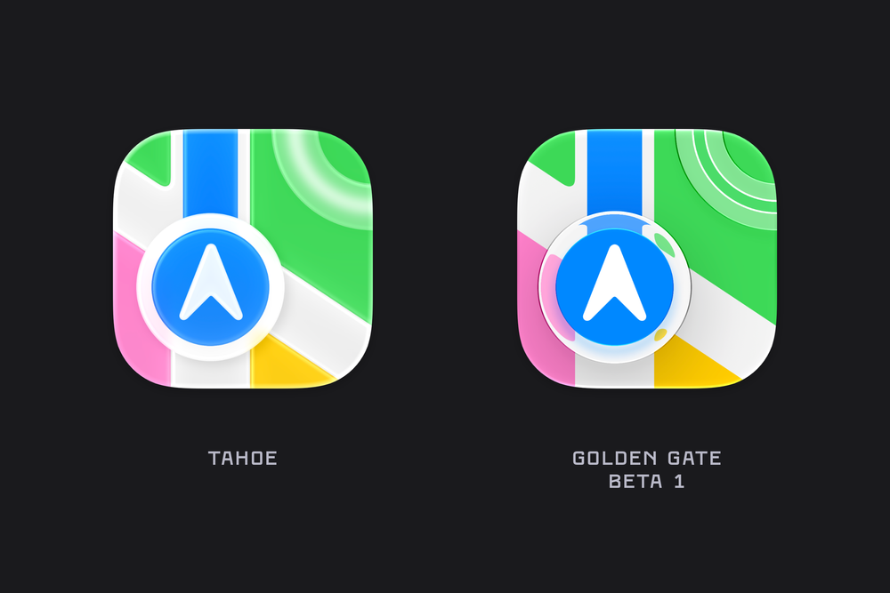
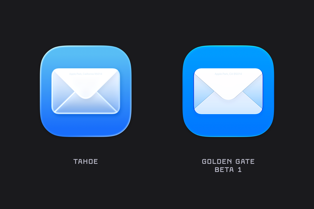
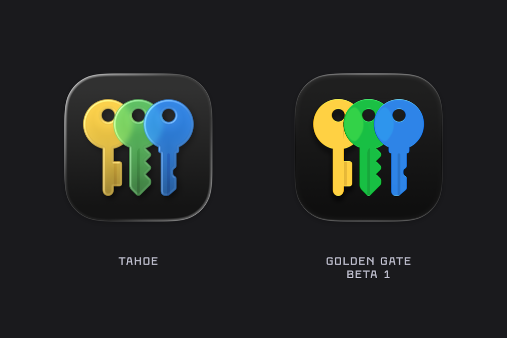
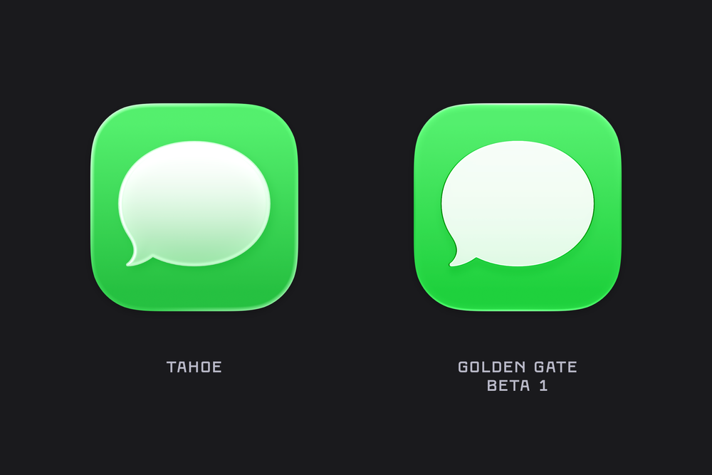
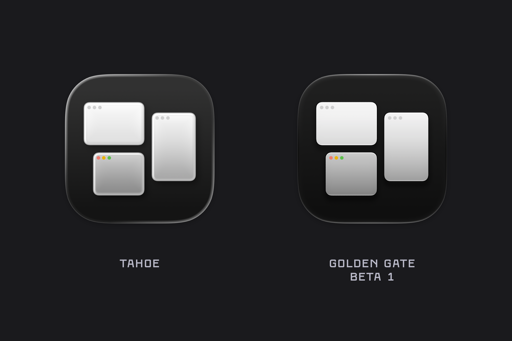
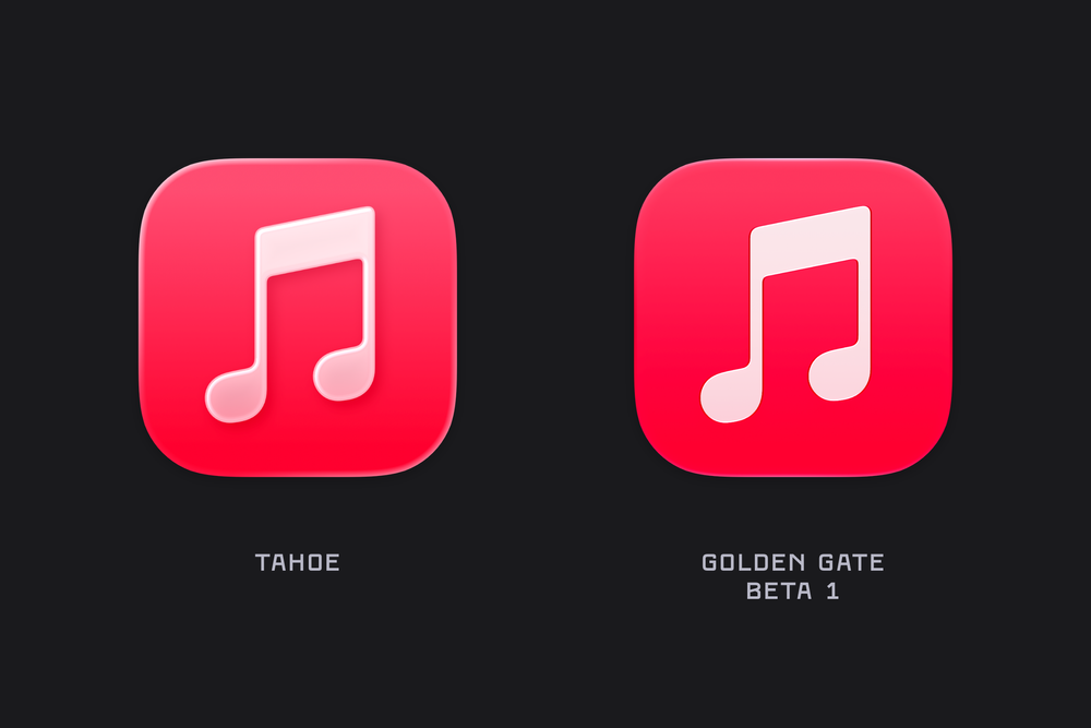
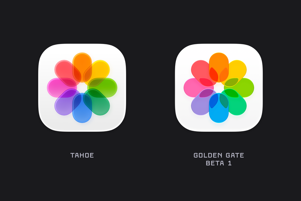
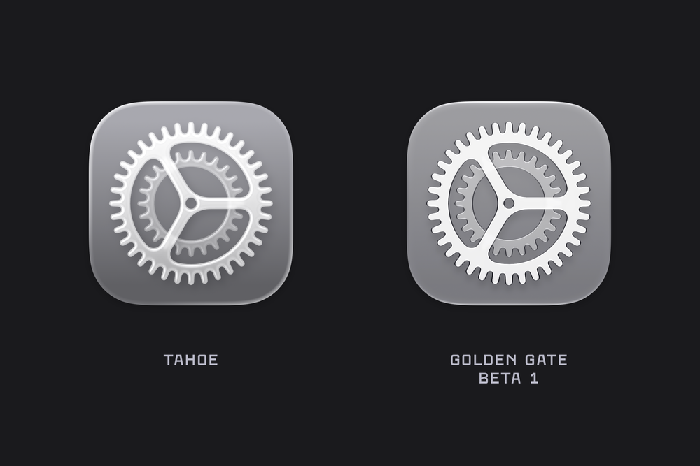
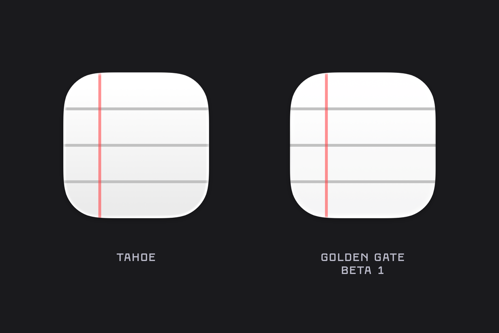
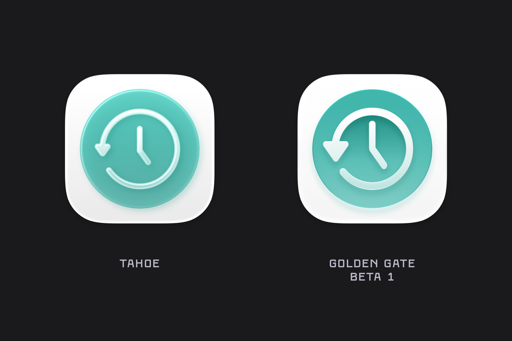
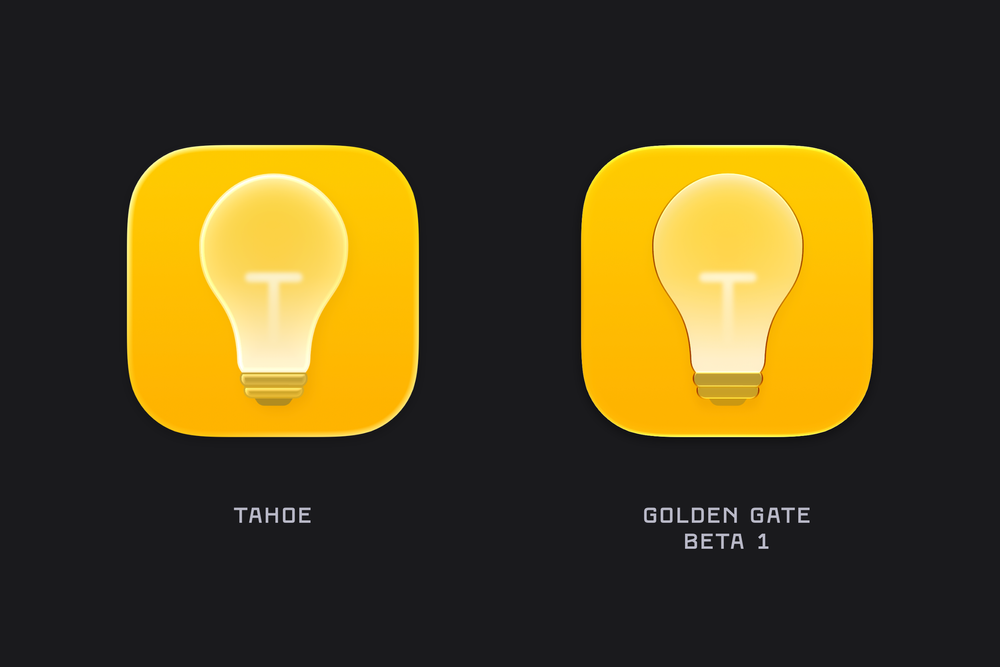
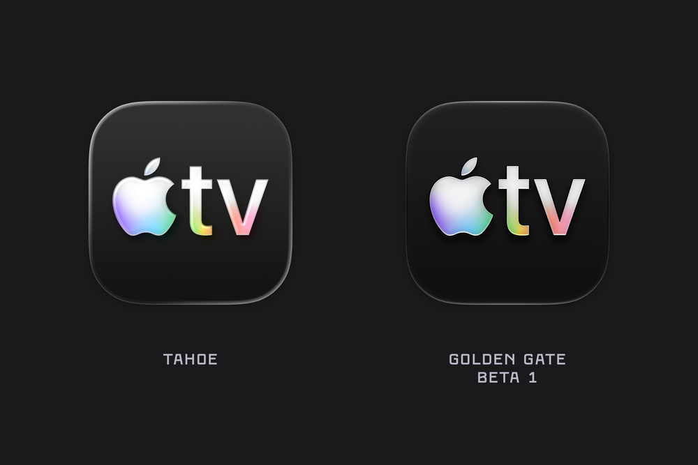
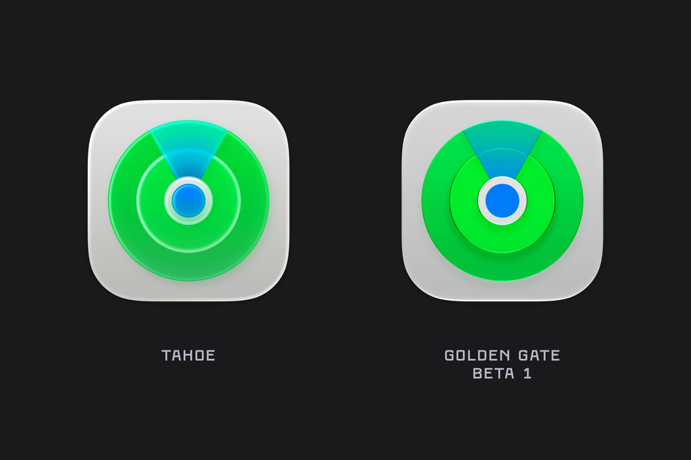
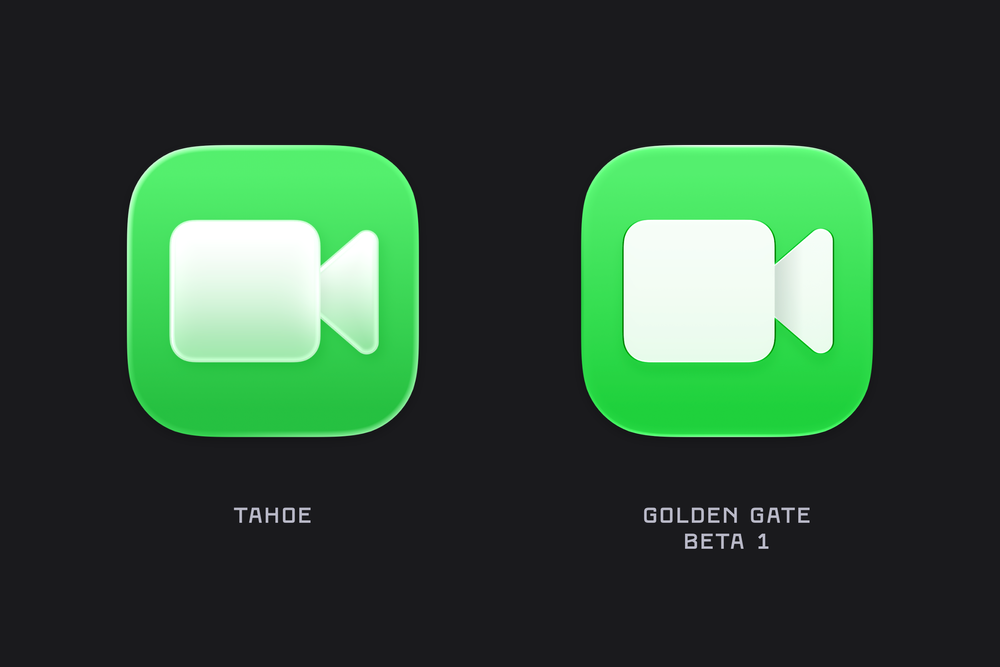
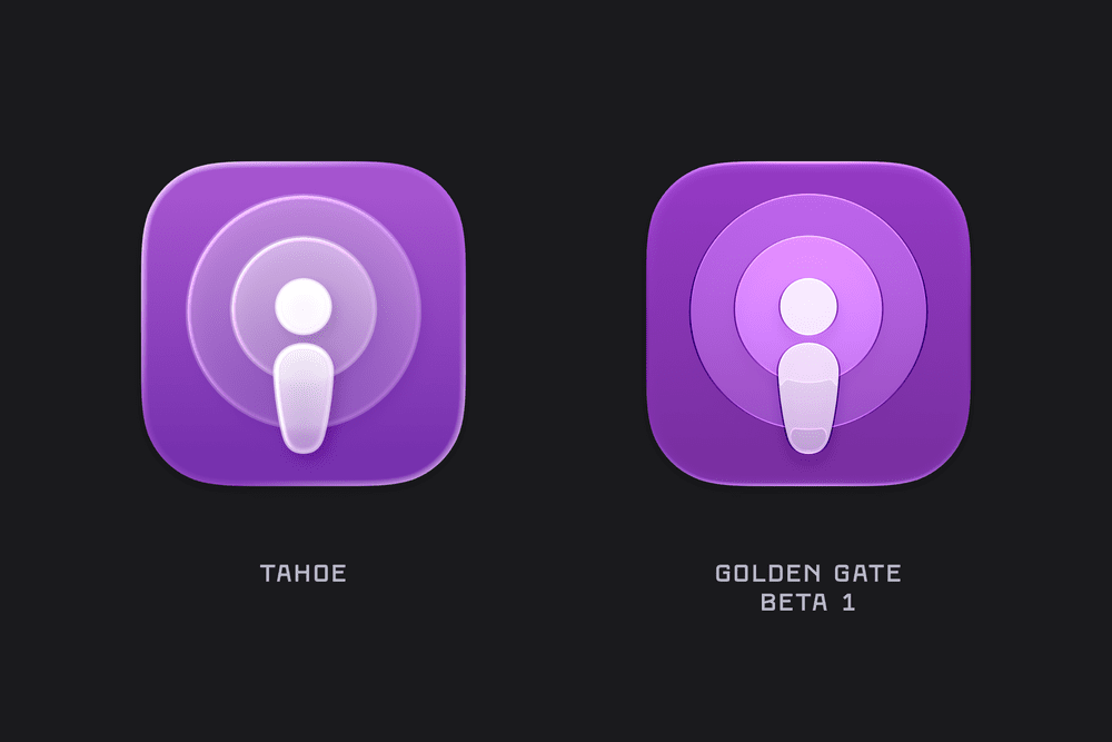
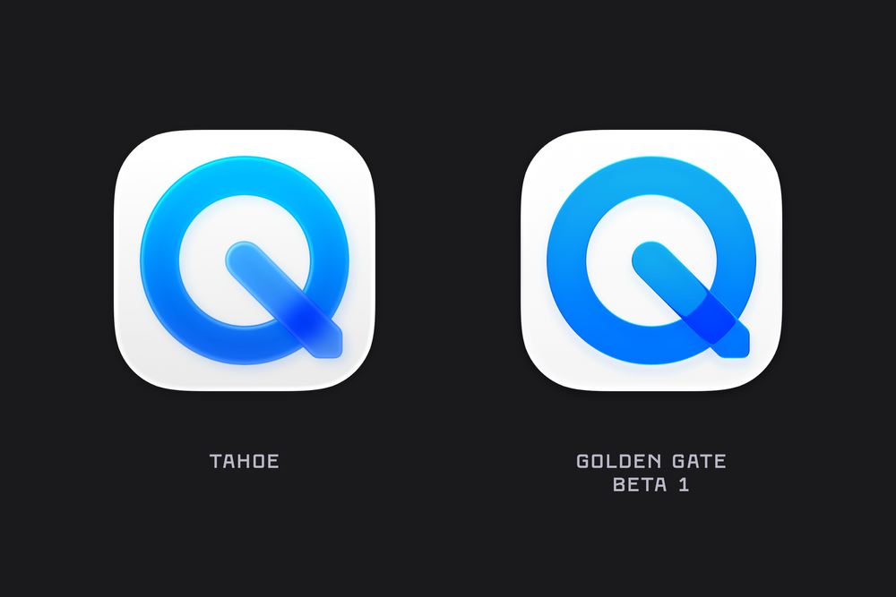
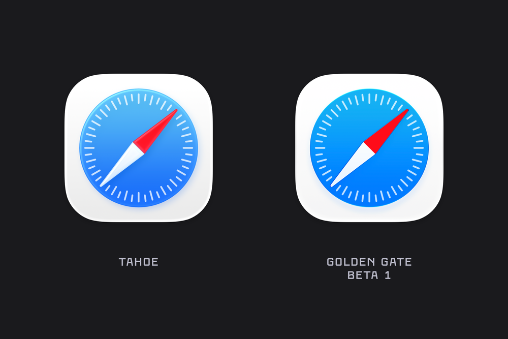
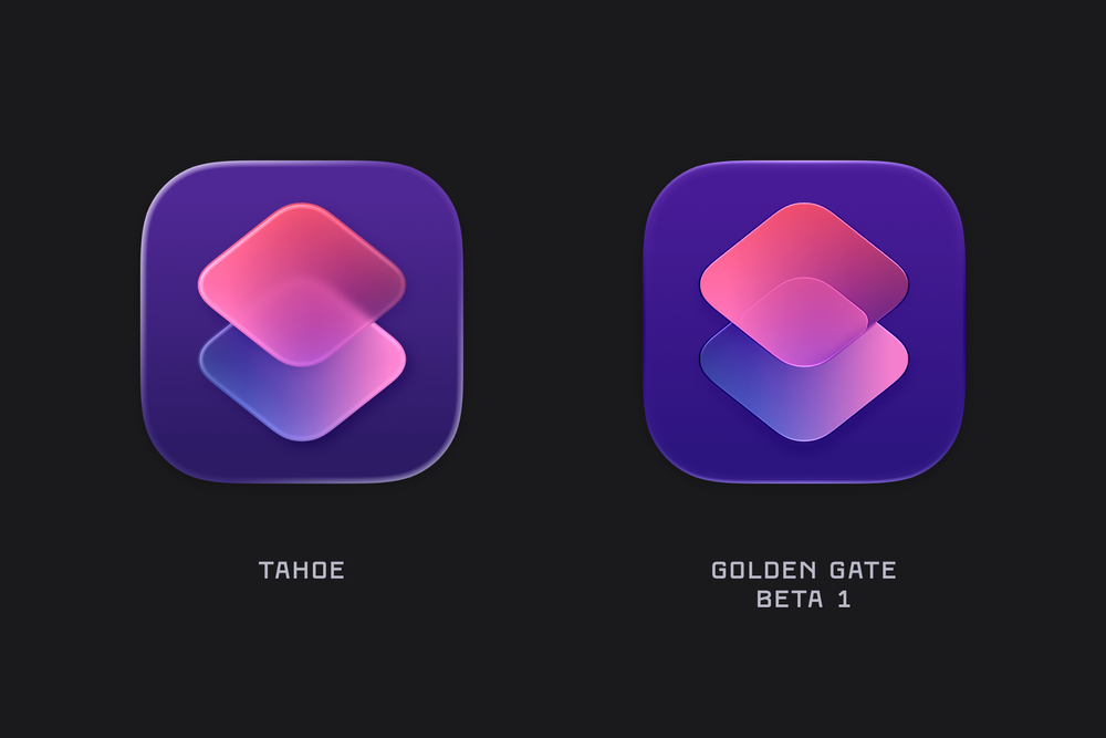
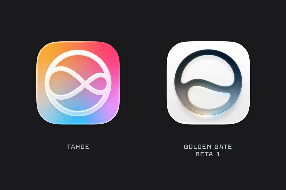
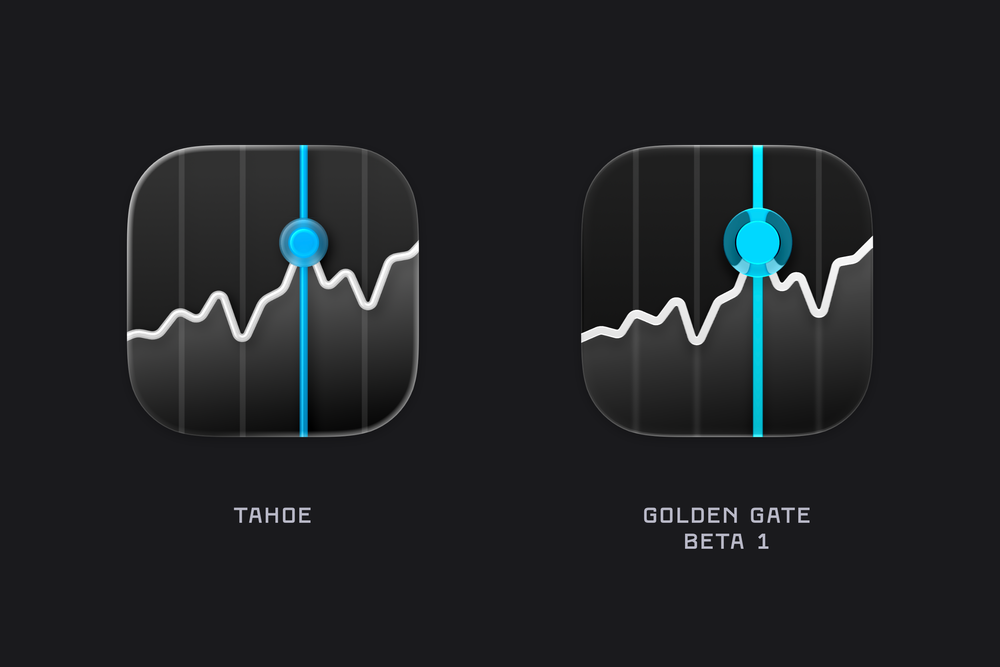
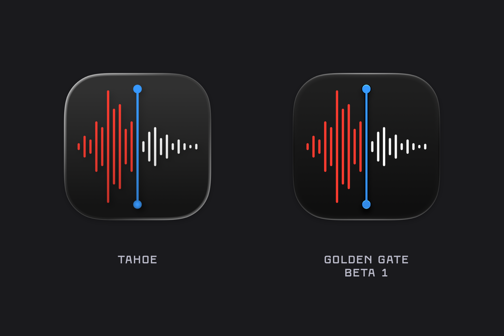
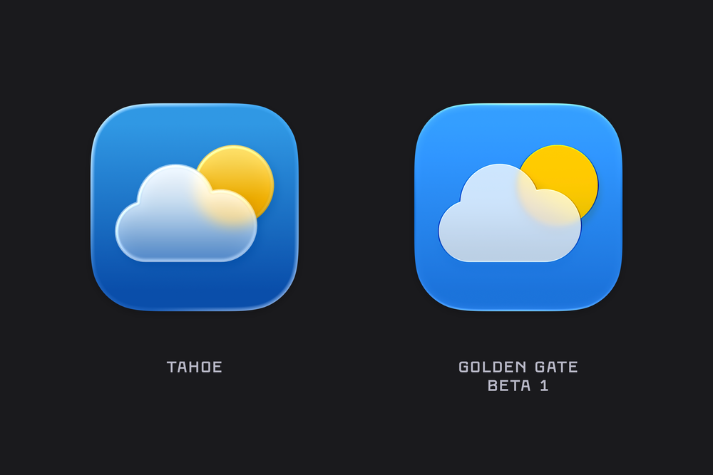
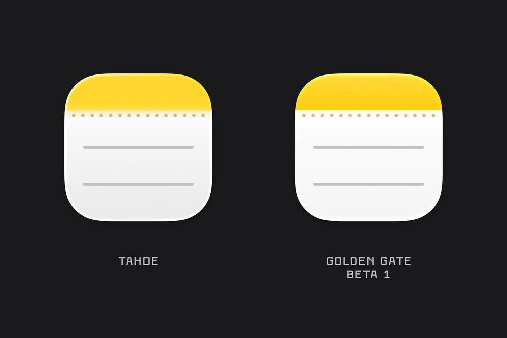
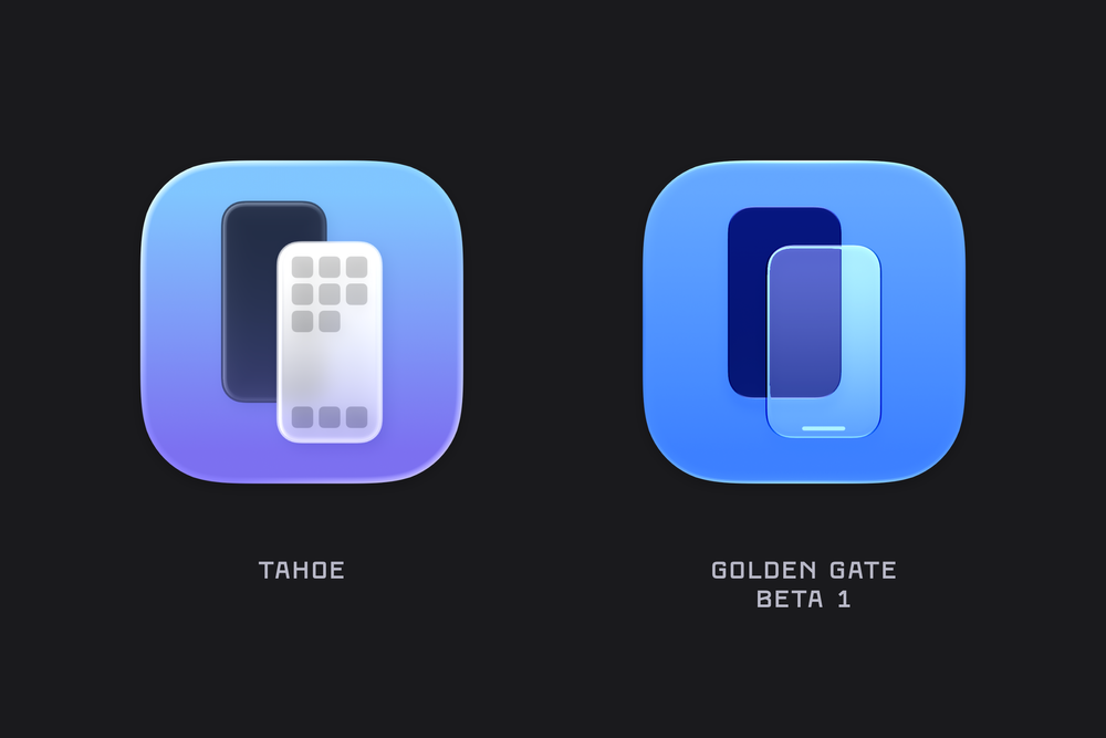
Comparing the macOS System Icons between Tahoe & Golden Gate (beta 1).![]()
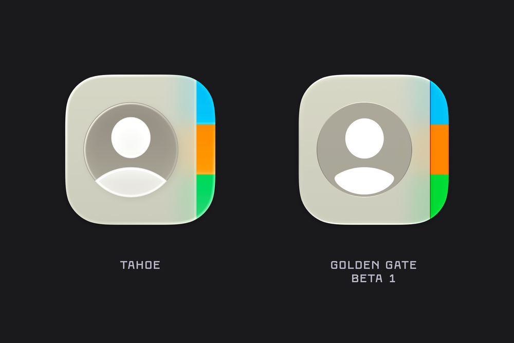
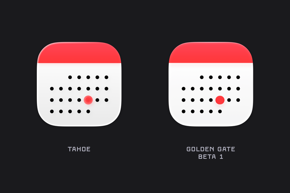
WWDC always brings a torrent of new content, details, and platform-wide changes. One of the first things I noticed after installing the macOS Golden Gate beta was the updated icon design. The colours are much bolder, several icons have been adjusted, and the refraction in the Liquid Glass effect has changed significantly, especially in icons like Journal.
There’s also a noticeable sharpness to the icons, along with a flattening of the Liquid Glass effect. I’m not sure yet whether this is simply an early-beta artifact or the intended final look. For example, while I really like the redesigned Finder icon, the sharp black edges around the nose currently feel a little unrefined.
Here are a list of many of the icons across macOS Golden Gate (beta 1) compared to their liquid glass Tahoe counterpart. Enjoy!
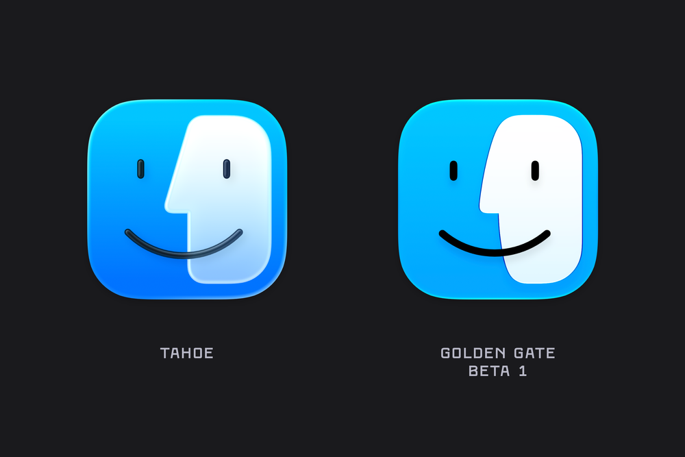
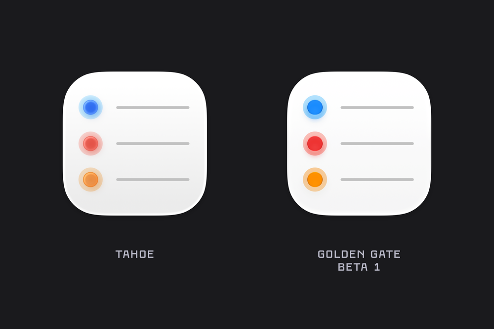
Finder has undergone a bit of rhinoplasty over the past year, returning to the more rounded nose that recalls earlier iterations of the icon.
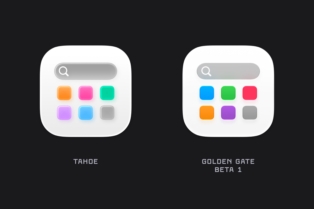
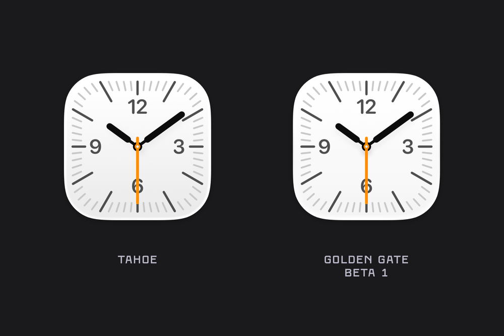
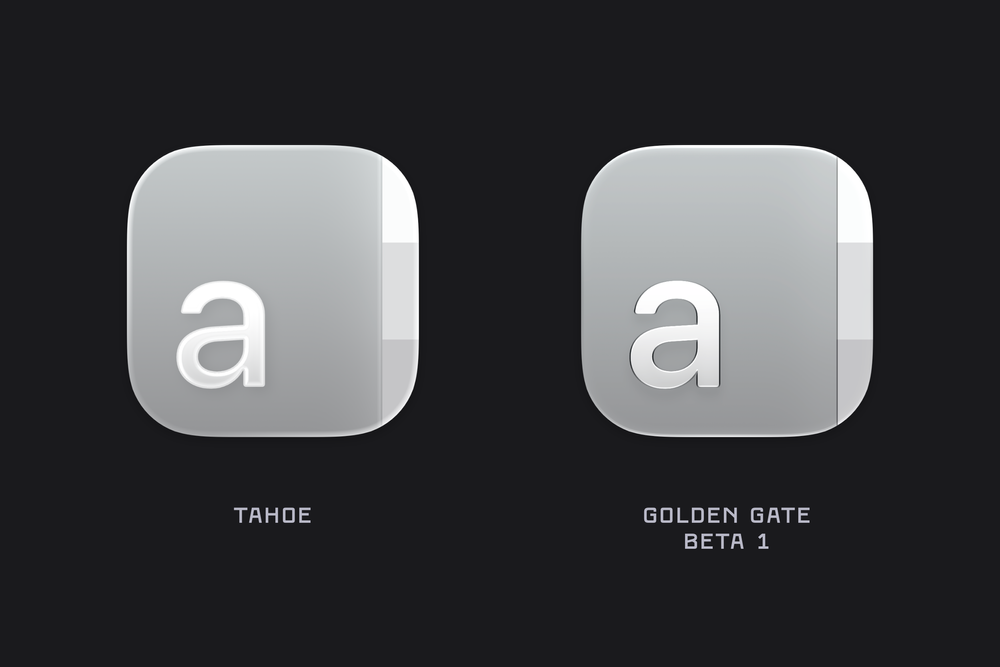
Updated colours, and the refractive properties of the Golden Gate icons are especially noticeable when you compare how the circle distorts as it approaches the edges of the rounded rectangle layered over it.
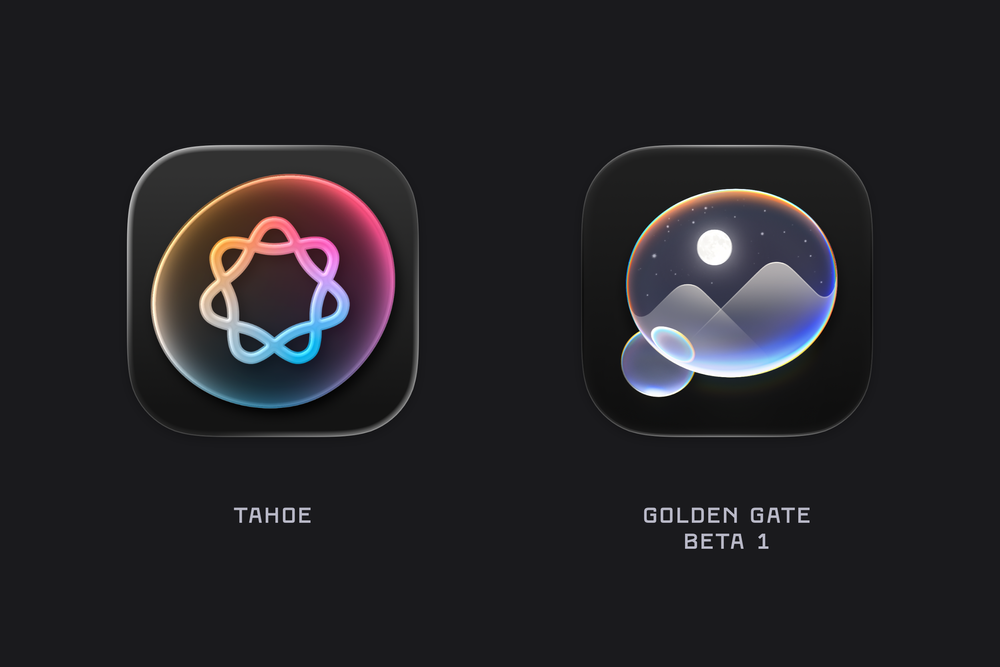
Journal is another example where we can see the updated refraction brought to macOS icons.
2026-06-09 04:08:50
Apple’s Crack Marketing Team’s Golden Gate Adventure…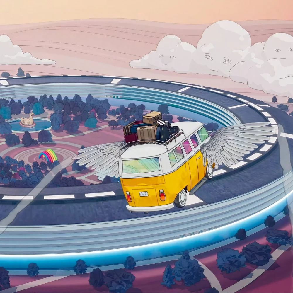
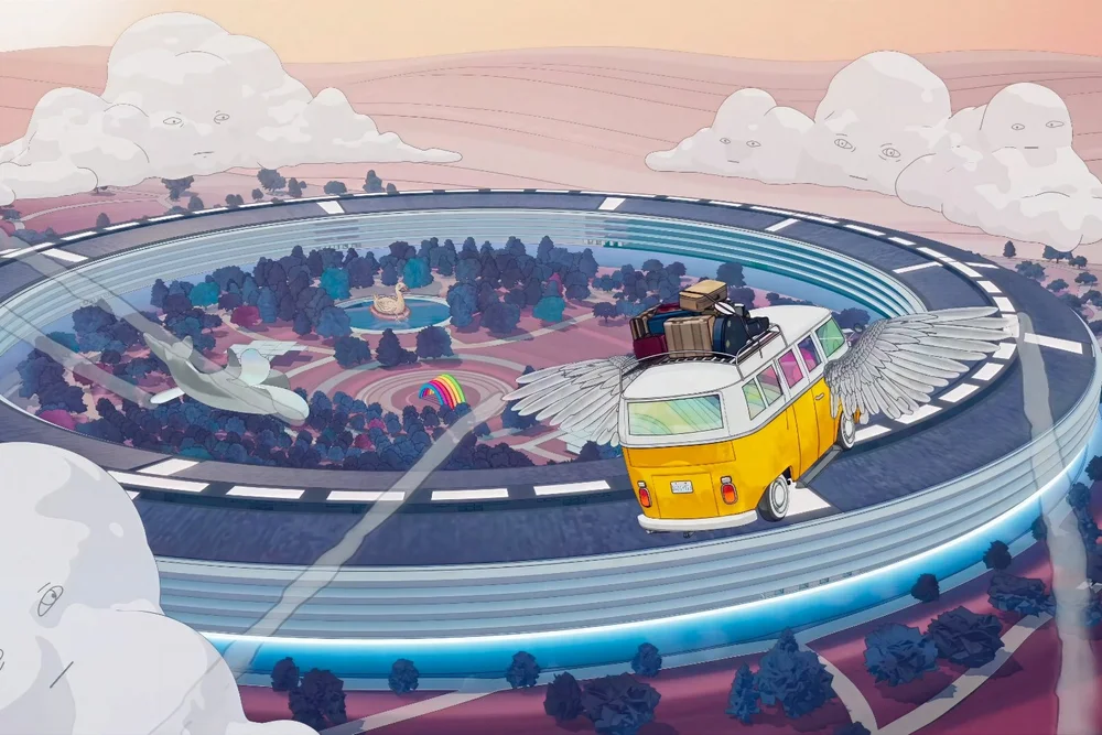
During Apple’s announcement of the next version of macOS at this year’s WWDC, we watched Apple’s crack marketing team’s VW Microbus take a psychedelic tour across a landscape filled with creatures made of thumbs, launch into space and weave through the craters of an asteroid, dip under the Golden Gate Bridge while narrowly avoiding a pair of quadcopter bugs, and eventually arrive at Apple Park as a winged dolphin glided overhead.
I thought the animated sequence was pretty delightful, so I captured four of my favourite frames, upscaled them, and posted them here for everyone to enjoy.
“Speaking of macOS, for those of you that are WWDC regulars, you of course know that this is the moment where I relay the latest exploits of Apple's crack marketing team, and their, shall we say, unconventional methods for naming macOS releases. In this case, I'm afraid the story is incomplete.
Last I saw them, they just spilled out of their recently installed Apple Park "experiential ideation yurt" and piled into their microbus. I tried to catch them, but they just handed me this note out the window before motoring northward. So here's all I've got.
‘Dude, our chakra alignment has set our compass toward the summer of love. But like, further. Our corporeal forms know no earthly tether. We shall float on a span of gold over infinite seas, flying so high. Marketing is such a great job.’
Okay, well, I'm afraid they haven't returned and I'm lacking the sensory amplifiers to crack this code. So I guess the great era of macOS names must come to an end.
Joz: It's Golden Gate, man.
Oh thank goodness. Perfect. Our next version of macOS is macOS Golden Gate.”


Version 01 | Version 02 | Version 03

2026-06-05 22:20:28
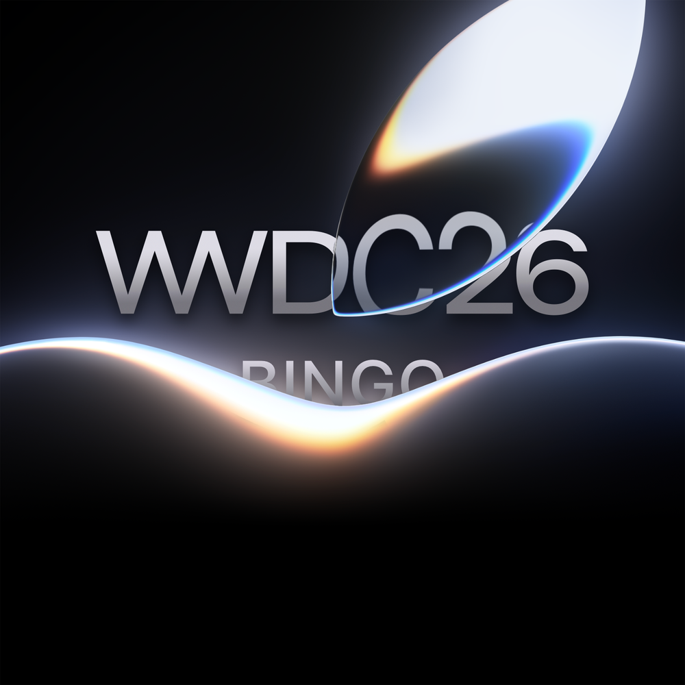
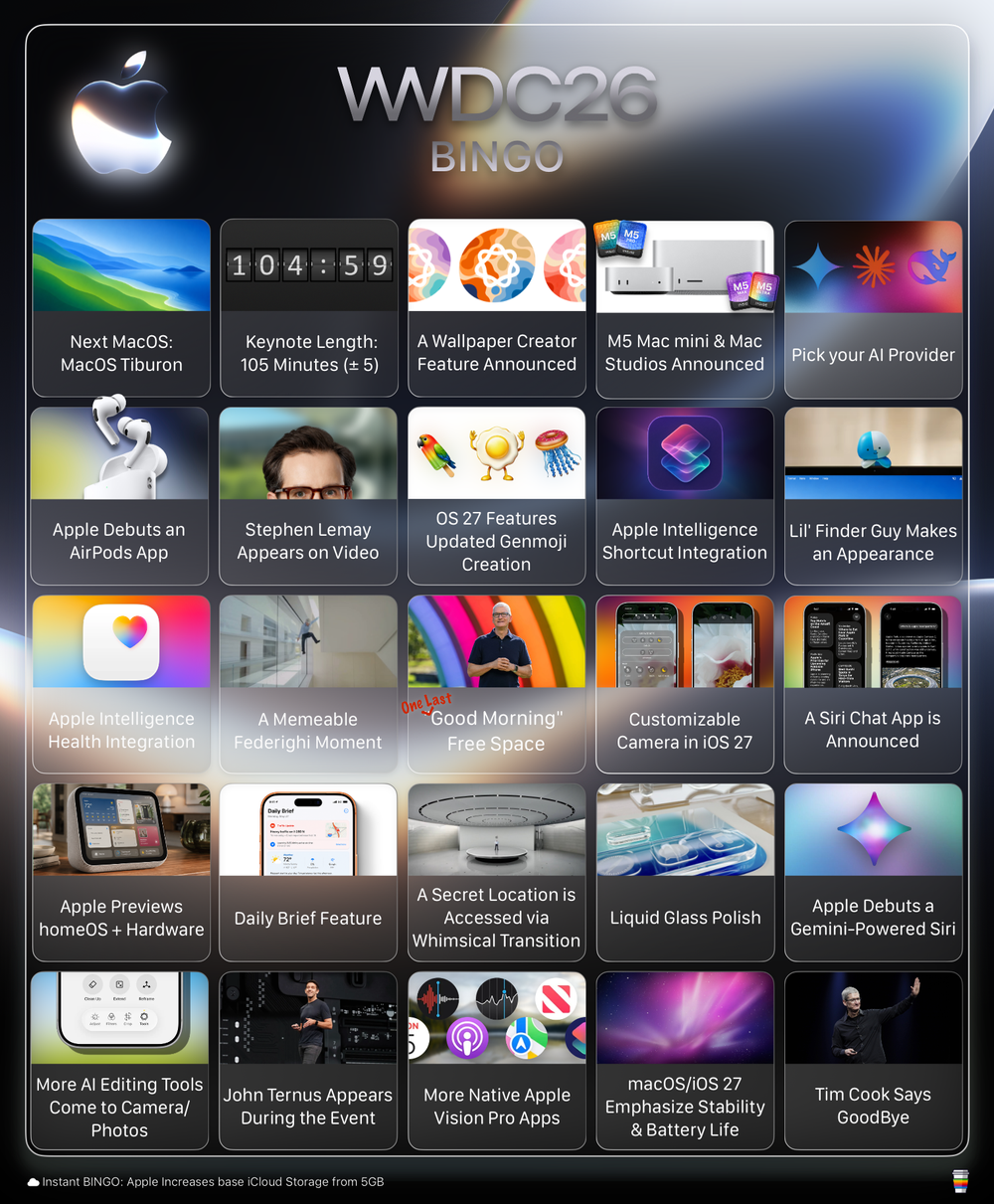
It’s nearly time for WWDC26, which means it’s time to make my annual bingo board of predictions, prognostications, and presentation ponderings ahead of this year’s keynote.
Two years ago, Apple unveiled Apple Intelligence, which I think most people would pretty unanimously agree has been a significant miss for the company. The fallout from that failed rollout has led to lawsuits, organizational reshuffling, and a pretty significant directional repivot inside Apple.
Looking back now, I don’t think anyone would have expected that the solution would be Apple adopting Google’s Gemini to power its AI push, as the rumours now seem to suggest. But here we are.
Fortunately, Apple has managed to maneuver these past two years quite adeptly. And as Google battles with other AI makers like Anthropic and OpenAI, Apple has benefited from their sizeable platform base to have these apps installable and usable across most of its platforms. Apple may not have had its own AI story figured out, but it has still benefited from these companies competing for more and more customer attention across its platforms.
This year, I think many of us are expecting to see Apple do a lot more with AI across the OS. Apple and Google have reportedly been working on bringing Gemini into Siri, and we’re expecting to see the fruits of that integration at this year’s event.
But what else does Apple plan to announce at WWDC? And how will all of these integrations come together? That part is still very much shrouded in mystery.
So I’ve done my best to compile as many picks and predictions as I can, from what I think might happen, to what has been rumoured, to a few selections meant purely to manifest the things I want to see. So play along as we watch WWDC together!
Note: The board was assembled in picks made from late May and locked in on June 3.
Winning in Bingo means completing a specific pattern on your card, in this case, a row, column, diagonal, or the entire card. The "Good Morning Free Space" in the centre is already marked and can be part of any winning pattern.

Mockup of a hypothetical macOS Tiburon Wallpaper.
This year, my pick for the name of the next version of macOS is macOS Tiburon.
As of 2025, Apple still had a number of California-themed names protected, including California, Condor, Diablo, Farallon, Grizzly, Mammoth, Miramar, Pacific, Redtail, Redwood, Rincon, Shasta, Skyline, and Tiburon. That list is from before WWDC25, when Tahoe was announced, so it’s far from a guarantee that this is the definitive list of possible names.
It’s also worth noting that Tiburon has shown up in a couple of Apple screenshots, which, again, guarantees absolutely nothing. And now that I think about it, that might actually make it less likely to be the chosen name.
Tiburon, if you’re curious, is a small bayside town just north of San Francisco.
Update: The code word “Big Bear” has been spotted in relation to some of the teaser WWDC images, leading people to belief that might be the name of the next version of macOS.
For the past half decade, virtual WWDC keynotes have regularly cleared the 100-minute mark. But in 2025, Apple’s keynote was noticeably shorter than its predecessors, landing at 92 minutes and 26 seconds.
This year, based on what I’m predicting and hoping to see, I imagine Apple returning to a more true-to-form WWDC keynote. My guess is that we see the presentation stretch closer to the 110-minute mark, which would make it the longest WWDC keynote of the post-COVID era outside of 2023, when Apple debuted Vision Pro and clocked in at a hefty 126 minutes.
There are rumours that Apple is poised to be launching some sort of Wallpaper Creator feature for their platforms. Users may be able to use something like image playgrounds to create custom backgrounds using prompts, photos from the users library, etc.
Bigfoot, the Loch Ness Monster, and the 256GB M3 Ultra Mac Studio. What do these three things have in common? Many have claimed to see them, but no one can seem to find them.
Apple appears to have found itself caught up in the global RAM and chip shortage, as supply and demand continue shifting toward powering ever-larger data centres. Shipping dates for some Mac Studio and Mac mini models continue to slide, while more configurations appear unavailable or have been removed from Apple’s website altogether. Earlier this year, the 256GB and 512GB memory configurations of the Mac Studio vanished from Apple’s online store.
Which makes me wonder if Apple will use WWDC to introduce updates to these increasingly hard-to-find desktop devices.
It’s not every year Apple launches hardware at WWDC, but the Mac Studio and Mac mini are both due for attention, and they have become especially popular among people working with AI-heavy workflows. So this feels like one of the more plausible places for new models to debut.
That said, I shudder to think what the pricing might look like for any higher-spec memory configurations, given the inflated market we’re in right now.
Currently, Apple only has OpenAI’s ChatGPT available as a direct OS-level plug-in across its platforms. But with Google Gemini coming on board, I imagine users will be able to select the provider of their choice, whether that’s Claude, ChatGPT, Gemini, or another AI service altogether.
Apple has already added plug-in support for both OpenAI’s Codex and Anthropic’s Claude in Xcode, so seeing that same kind of connectivity and choice expand to other parts of the OS feels like a pretty natural next step.
As AirPods continue to gain features and complexity, the case for a redesigned & dedicated hub to manage their settings keeps getting stronger.
Right now, AirPods settings appear when the earbuds are connected, but that menu has become a mile-long list of options: battery life, listening modes, hearing health, press-and-hold actions, call controls, Camera Control, audio settings, Automatic Ear Detection, Spatial Audio, Live Translation, microphone settings, sleep controls, head gestures, case sounds, Find My, Accessibility, hearing mode, privacy, device information, AppleCare+ details, and finally the Disconnect and Forget Device options.
At this point, I think AirPods are overdue for their own dedicated app or settings redesign. Something that more thoughtfully organizes this laundry list of features and presents them in a cleaner, more structured, and more approachable way.
Alan Dye skipped town for Meta late last year, leaving his role to be filled by longtime Apple user interface designer Stephen Lemay.
Lemay is now in his third decade at Apple, having joined the company back in 1999, and now holds the title of Vice President of Human Interface Design.
Just as Jony Ive and Alan Dye have done in years past, I expect we’ll see a small segment during the keynote where Lemay speaks to some of the design refinements and updates being introduced across Apple’s platforms this year.
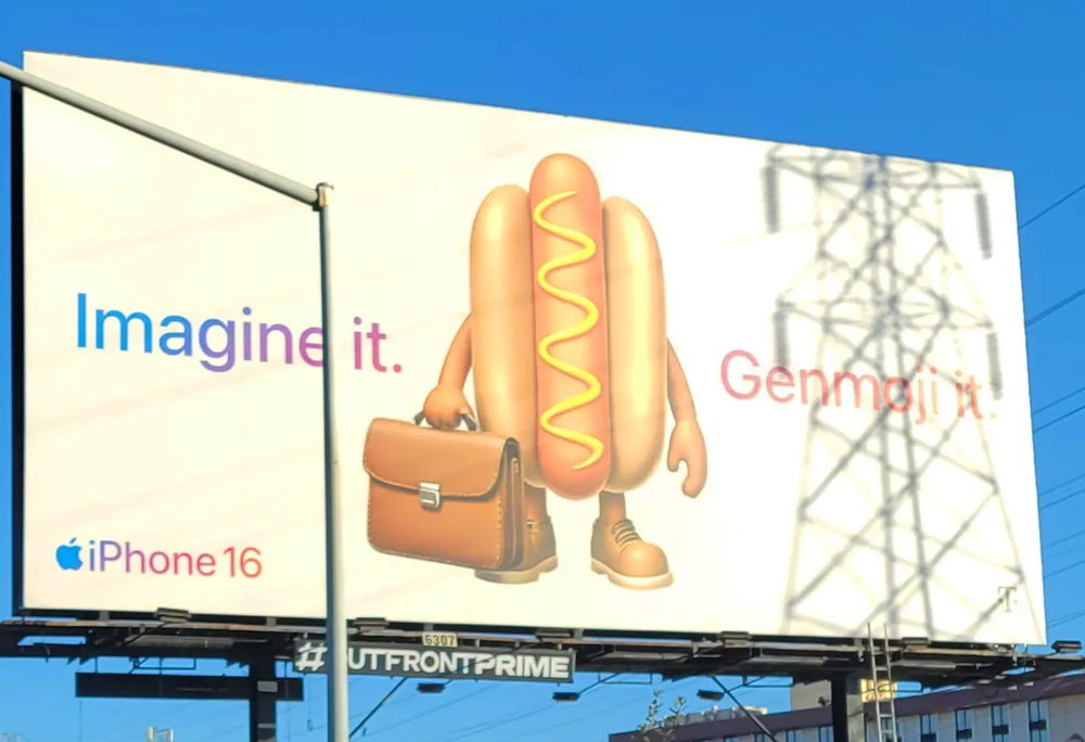
Genmoji Billboard.
I don't know how popular this feature continues to be, despite Apple's Pro prolific billboard campaign, but I expect at one point during the keynote that they'll make mention of improvements to Genmoji creation.
I wonder if we’ll see Apple integrate more Apple Intelligence into the Shortcuts app, giving us lay users a simpler and easier way to create shortcuts.
Maybe that looks like chatting with Siri in natural language and saying, “I need you to take these 10 images, crop them, and convert them into JPGs,” and having Shortcuts build the automation for you. Or maybe Apple could surface recommended shortcuts based on common actions you perform, giving people an easier entry point into automation without needing to understand all the fiddly bits that make Shortcuts feel so intimidating.
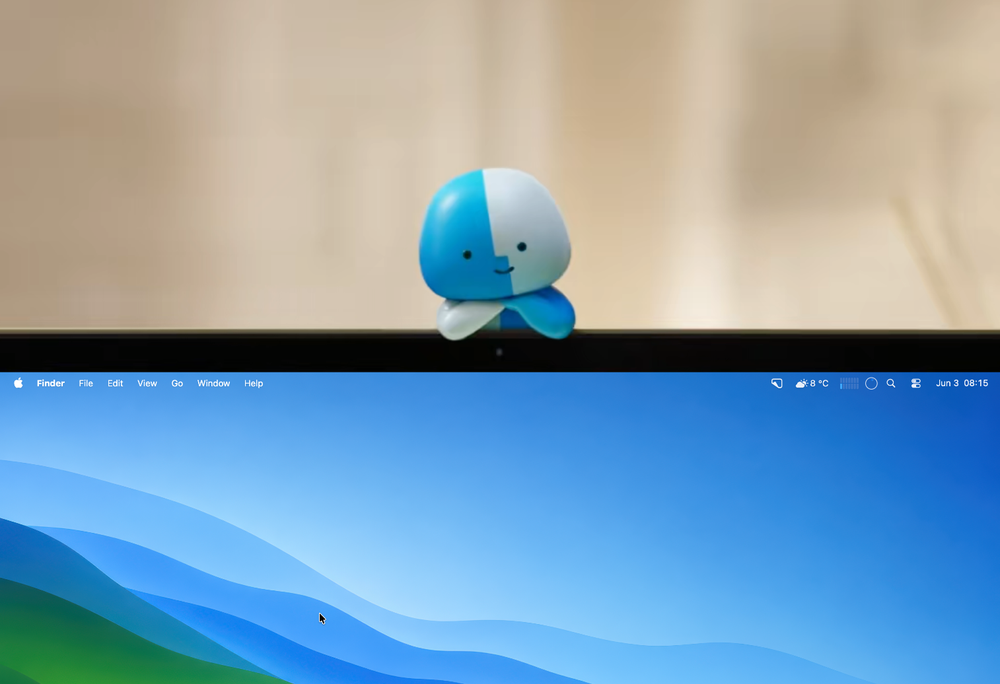
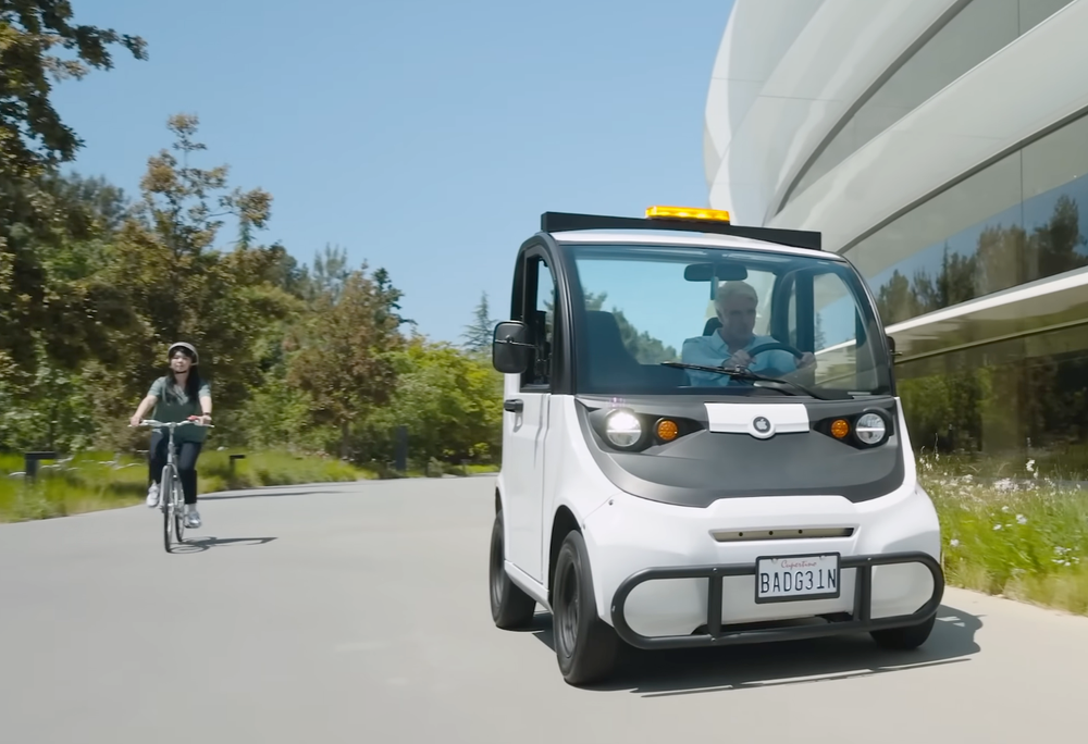
Lil’ Finder Guy made their debut alongside the launch of the MacBook Neo, and so far, they seem to be a mascot mostly dedicated to marketing the Neo, and Mac features more broadly, via the lens of the MacBook Neo on TikTok.
I have no idea what Apple’s long-term plans are for their tiny viral mascot, but I’m manifesting some kind of easter egg at the event. Maybe they show up in a screenshot, maybe they’re hiding in the background during a feature demo, or maybe Apple sneaks them in somewhere else entirely.
Apple has built an incredibly robust app for cataloguing health information, but so much of that data still feels passive. It gets collected, stored, and occasionally surfaced, but rarely analyzed in a way that feels personal or genuinely useful beyond more basic insights like sleep scores.
I wonder if Apple will start injecting more on-device Apple Intelligence into the Health app to provide users with more personal, dynamic insights into their health trends. Apple has long been rumoured to be working on some sort of fitness coach, and this feels like a natural place for those features to first appear.
Imagine being able to ask the Health app a question about your own health and getting a thoughtful, guardrailed response based on your actual data. If I asked how to build more muscle, it might notice that most of my workouts are walking-based and suggest adding more functional or strength-based training. If I asked about fat loss, it might look at my recent workout heart rate zones and suggest ways to spend more time in higher-intensity zones.
The Health app already has the data. What it needs next is a way to help users better understand what that data actually means.
Apple’s parkour-loving, golf-cart-racing, three-headed-guitar-playing, skydiving madman, last seen racing donuts on the roof of Apple Park, is sure to surprise us with another memeable… I mean, memorable WWDC performance.
I believe Tim Cook, who will still be Apple’s CEO at the time of the event, will open the video presentation with his signature Southern-style “Good morning” for the last time.
Customizable Camera App. Source: Bloomberg
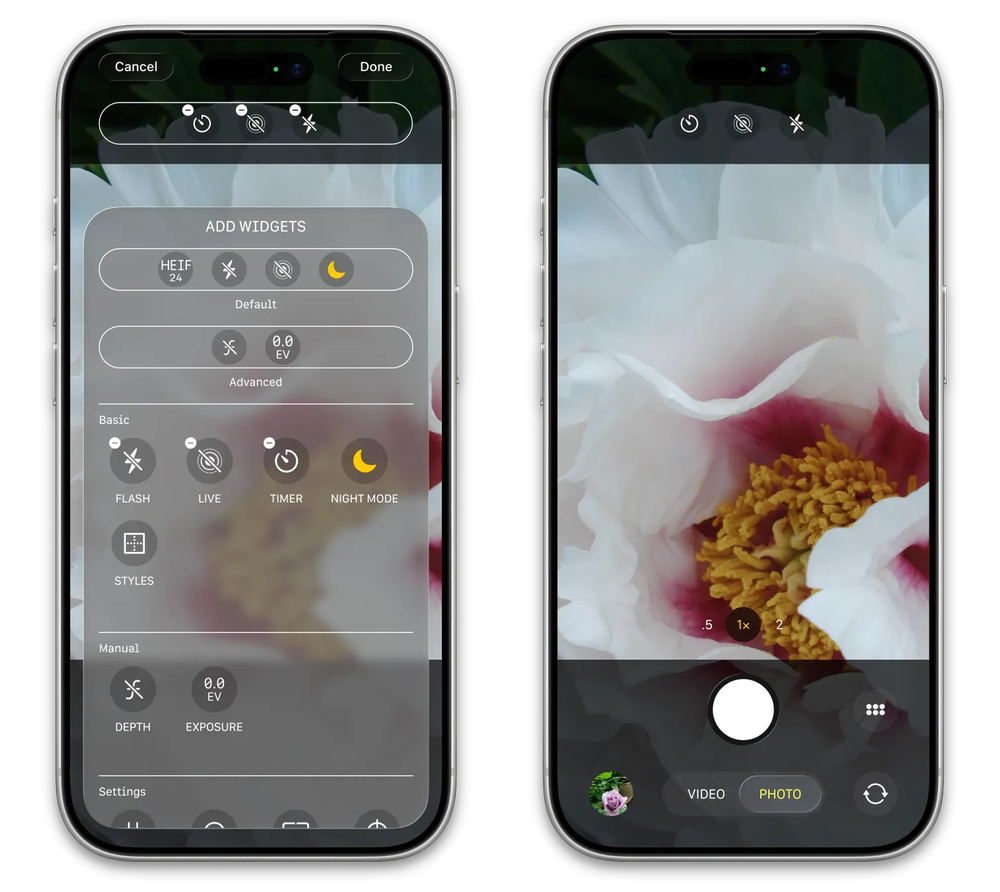
I’d like to see Apple take a step toward making the Camera app in iOS 27 more customizable. Apple has so many buried featured inside their camera app and I would like them give users the ability to surface and customize the layout of their controls to better suit their needs. For example, if someone wants a persistent exposure controller, let them pin it. If someone regularly adjusts aperture, let them keep that control closer at hand. The Camera app is already incredibly powerful. I’d just like to see Apple give users a little more say in how that power is organized.
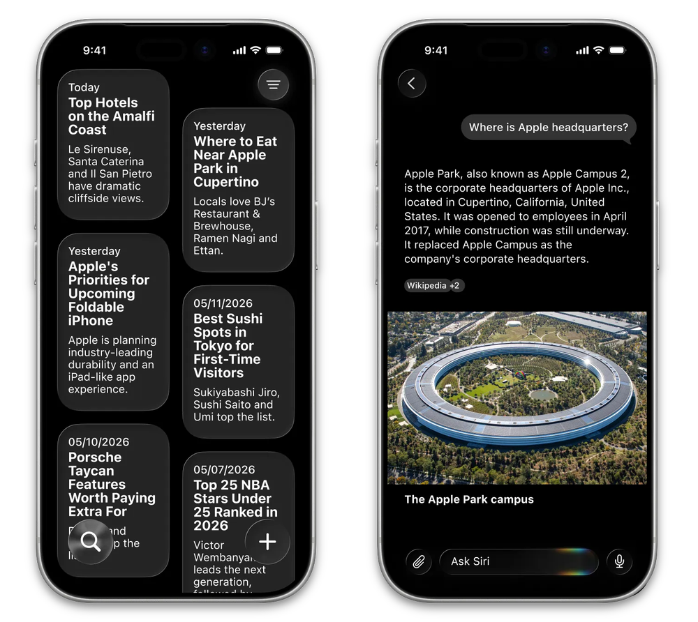
Siri Chat Bot mockup. Source: Bloomberg
Chatbots have proven to be incredibly popular interfaces for interacting with AI, and I expect Apple to compete by introducing a chatbot interface of its own.
I imagine this’ll be a standalone app that allows users to talk or text directly with Apple’s AI to ask questions, perform functions on device, or access world knowledge. Depending on the complexity of the request, Apple could choose to handle the task locally or hand it off to its Private Cloud Compute models when more power or broader context is needed.
Gurman seemed to reveal as much in late May, when he published concept artwork showing what these interfaces are expected to look like.
According to the rumours, Apple has been sitting on a nearly finished lineup of new home accessories designed to be powered by Apple Intelligence. However, since Apple Intelligence has spent the past couple of years mostly being used to make parrot popsicle Genmoji, these products appear to have been stuck in a bit of a holding pattern.
I expect Apple will preview the first wave of these devices, along with the new operating system powering them, at this year’s WWDC. These are widely rumoured to be smart home devices in the vein of Amazon Echo or Google Home, featuring a screen, speaker, and a modified version of iOS. Let’s call it homeOS.
I don’t expect any of this hardware to be available at WWDC. My guess is that Apple previews the category, gives developers the summer to start thinking about how their apps might work on this new accessory line, and possibly offers some form of developer kit to select partners so they can begin testing these experiences in the real world.
Extending on the promises of 2024, I wonder if Apple could use all of the Apple Intelligence features being built across the OS to create some sort of daily brief.
Whether it appears as a notification, email, widget, Siri summary, or something else entirely, the idea would be to give you a bird’s-eye view of your day before it really gets going.
In the morning, it could surface traffic reports, suggest when to leave, recommend alternate routes, provide an outline of your schedule, highlight relevant reminders, and maybe even make suggestions about when to get certain things done. For example, if traffic is expected to be heavier after work, it could suggest stopping at the grocery store near your office before heading home. Or if you have a meeting later in the day, it could surface the relevant emails, links, notes, or files you might need before you’re scrambling to find them.
The whole purpose would be to quietly connect the dots between Calendar, Reminders, Mail, Maps, Weather, etc., and then give you a useful snapshot of what matters most that day.
In addition to the expected drone footage around Apple Park, at some point, we'll transition from one place to the next via some fancy corridor, escape hatch, portal, or secret underground tunnel accessed via the fountain inside the courtyard of Apple Park.
It was all too easy to poke fun at some of the more glaring oddities of Liquid Glass. The skewampus and inconsistent rounding of windows. The transparency issues. The overall afterthought quality liquid glass got on macOS.
This year, I expect we’ll see a much more refined version of Liquid Glass now that Apple has had an entire calendar year, and our collective jeers, to fuel them.
I don’t think the rumours suggest some radical redesign. Rather, it might looks more like a year tightening things up, improving the shadowing, bringing more consistency to the system, and hopefully revisiting some of the more dreadfully lazy icons.
I also expect we’ll see more of a push to bring Liquid Glass properly into macOS, which lacked a lot of the animations, depth, and polish that iOS and iPadOS debuted with.
It’s widely expected that Apple will debut its Google Gemini-powered Siri at WWDC. After a two-year botched rollout of Apple Intelligence, Apple appears to be turning to Google Gemini, an established player in the AI space, to help power the next generation of Siri.
And that’s a pretty massive move. If Gemini becomes part of Siri, Google’s AI model suddenly becomes one of the most dominant AI systems across platforms around the world. Between Android and iOS, nearly every modern smartphone user will have a device that could soon be powered, in some way, by Gemini.
There are also rumours about how this new Siri might appear beyond the traditional “Hey Siri” (Yes, I still say the “Hey...”) command. Some reports have suggested it could be pulled down from the Dynamic Island, using the same glowing effect Apple has been teasing in its WWDC invite.
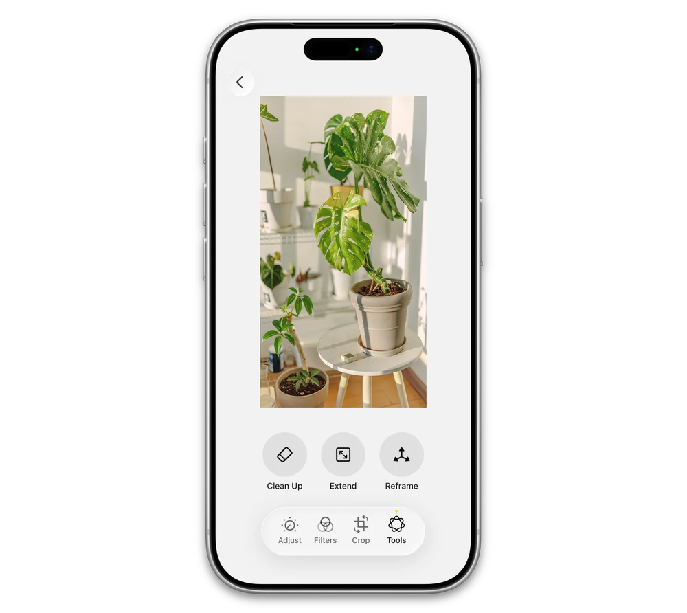
Photos AI tools. Source: Bloomberg
Back in 2024 with iOS 18.1, Apple introduced Clean Up, a photo-editing tool that uses on-device AI to remove people and objects from photos. It’s a handy feature, but it feels like just the beginning. This year, rumors suggest Apple is planning to bring even more AI-powered editing tools to the Photos app, potentially giving users the ability to extend, reframe, or otherwise enhance their photos with on-device models.
If Apple does indeed announce updated M5 Mac Studios & minis, we’re almost guaranteed to John Ternus feature during the video. But even if that hardware isn’t announced, I fully expect we see him make an appearance in some capacity during the event. This is, after all, his ship after August 31st.
Fool me once, shame on you. Fool me twice, shame on you. But fool me a third time? Shame on both of us.
For the past three WWDCs, I have been banging the drum for Apple to bring more of its native apps properly to visionOS. Apps like Reminders, Calendar, Podcasts, Pages, and Apple Books are still largely iPad versions, and many of them continue be very mid ports on Vision Pro.
I don’t think bringing a native version of Pages to visionOS is going to suddenly send people stampeding into Apple Stores to buy a Vision Pro. But it would be an important show of commitment to the platform. A sign that Apple is still investing in visionOS not just as a place for immersive videos and floating Safari windows, but as a real computing platform with first-party apps that feel considered, polished, and native.
Apple has recently made a bunch of changes to upgrade their Creator Studio apps, so it’s time to push those spoils into Vision Pro as well.
But I have pleaded for this for the last two years and been disappointed both times.
I’m ready to be hurt again.
Some in the Apple community have been waiting for this current generation of macOS to have its “Snow Leopard” glow up.
Snow Leopard, released in 2009, is still held in high regard because it focused less on obvious new features and more on core system performance, stability, and refinements to the architecture of the Mac.
If this year really is that kind of moment, I imagine Apple will spend time talking about improvements to the foundation of the operating system, and how those changes trickle down into faster performance, better efficiency, and improved battery life during everyday tasks.
I wonder if we’ll see Tim add a slightly more personal note to his sign-off at the end of the keynote, acknowledging that this may likely be his final widely-public words as Apple’s CEO.
Normally, he wraps things up by recapping the event, highlighting what developers can look forward to, and touting the exciting week ahead. But given that he has now been leading Apple for nearly a decade and a half, I wonder if we’ll see him add a small line reflecting on his role at the company. Nothing dramatic, of course, just a little extra feels.
If Apple announces an increase to its base 5GB iCloud storage (even if that change comes in the form of 5GB per device), then an instant BINGO is declared.
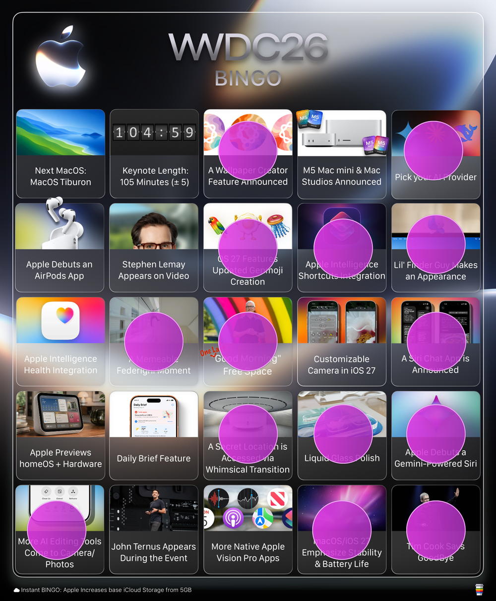
By my count, we did manage to hit bingo on the far-right vertical column. We got choice of AI services, Lil’ Finder Guy made an appearance both as a pin and as a background Easter egg in an early scene, Apple introduced a Siri chat app during the keynote, unveiled a Gemini-powered Siri, and Tim Cook took a few moments at the end of the presentation to say goodbye.
Unfortunately, we didn’t get a dedicated AirPods app, just a redesigned settings pane. There was also no new hardware announced. We came in well under the 105-minute prediction, with the keynote wrapping up in just 76 minutes, and despite some hopes for a broader push, Apple didn’t introduce any new apps for the Vision platform.

2026-06-02 02:16:29
Apple has stolen my thunder and released an official set of WWDC26 wallpapers.![]()
For the past several years, I’ve released my own WWDC wallpapers (2023, 2024, 2025) ahead of Apple’s annual developer event, inspired by the logos Apple shares in the lead-up to its week-long developers conference.
But this year, I’ve been Sherlocked.
Apple has taken it upon itself to release a trio of high-quality wallpapers for the Mac, iPad, and iPhone, giving everyone a way to adorn their devices ahead of WWDC.
The wallpapers are available on Apple’s developer page, but I’m also sharing them here for posterity’s sake, because who knows if or when they’ll disappear.
Enjoy!

2026-05-23 11:42:01
Clicky Klack, Menu Stats, and Dictation that Slaps.
It’s been over five months since I last did an app spotlight, which feels like as good a time as any to highlight a few apps that have found a comfortable place on my Mac.
I’d like to think I’m pretty picky when it comes to the apps that get to stay on my devices, so if something has earned a spot in my Dock, menu bar, or daily workflow, it’s probably doing something right.
Nearly 20 years in, iStat Menus remains the definitive menu bar app for seeing all the inner workings of your Mac.
iStat Menus has been around since 2007, so this is far from a new app. Still, whenever I post a screenshot, I regularly get asked about that little iStat Menus icon sitting in my menu bar.
For those new to the Mac, or who have somehow managed to avoid hearing about it, iStat Menus is a highly customizable menu bar utility that lets you track a dizzying number of things happening on your Mac.
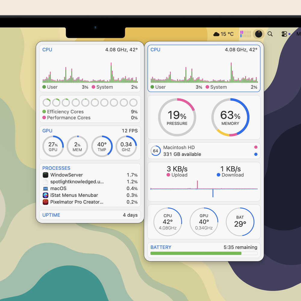
Screenshot showing my unified iStat Menus bar and a few of the tiles I have enabled. Hovering over a section, in this case CPU stats, expands the tile with additional information.
Curious about your uptime? There’s a stat for that. Available memory? Memory swap? SSD temperature? Battery life? Battery health? Network usage? There’s a stat for all of that and more, including sections for weather, time, calendars, and on and on.
You can customize what you want to see as well, showing only the data you’re curious about in the menubar itself and/or in the clickable dropdown panel. Furthermore, you can customize the colours of the text, graphs, and gauges to your hearts content.
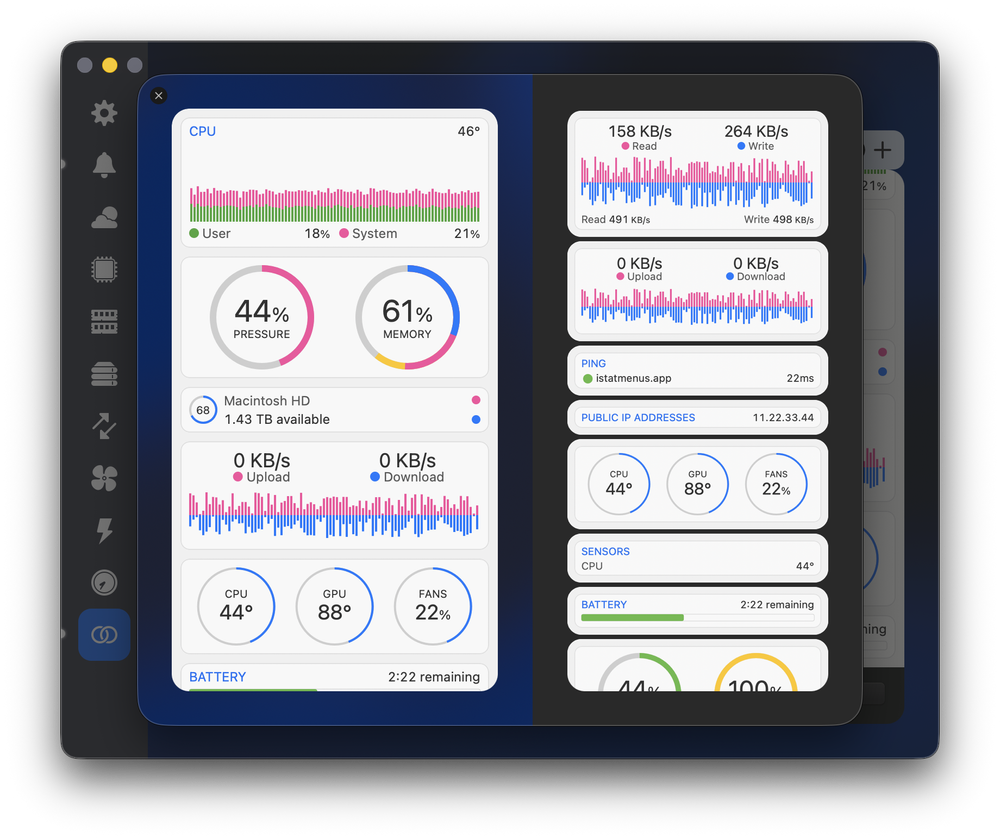
Customize the colours, customize the tiles, and customize exactly what you want to see in the menu bar itself.
For me, iStat Menus is partly cosmetic. I enjoy seeing the data and getting a better sense of what’s happening under the hood of my Mac. But more than that, it provides a comprehensive little portal for understanding and managing my Mac’s battery life, spotting apps that are using more memory than expected, or noticing when something is causing my Mac to run hotter than it should. But you can also use it to see the weather (paid upgrade), see your calendar and events, view the time in different timezones, the phases of the moon, when golden hour is, and even track the location of the ISS.
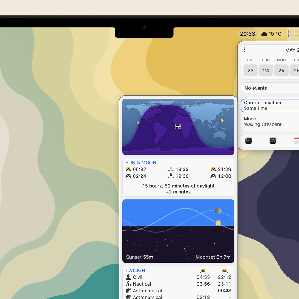
If you were hoping for an app that also happens to show the current location of the ISS, then boy do I have great news for you.
iStat Menus is one of the first apps I install on any new Mac, and it’s available from the Mac App Store or directly from developer Bjango’s website for under $20. There’s also a 14-day free trial, which gives you plenty of time to see just how many tiny stats you suddenly start caring about.
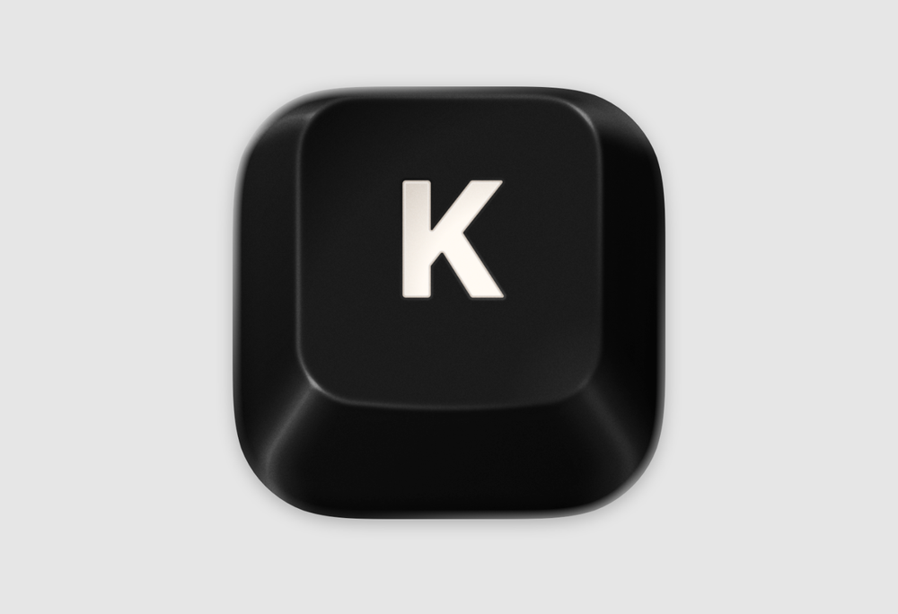
Turn your mushy MacBook keyboard into a satisfying, click-klacky symphony.
From the developer behind Alcove, another app I highly, highly recommend, comes Klack.
And what does Klack do? It adds a collection of deeply satisfying keystroke sounds to your Mac.
Klack Keystoke NoiseSample audio of my terribly slow finger-typing with Klack enabled.
Currently, it includes seven different switch sounds from various keyboard makers: Japanese Black from CherryMX™, Crystal Purple and Oreo from Everglide™, Cardboard from Flurples™, Milky Yellow from Gateron™, Super Red from Keychron™, and Cream from NovelKeys™.
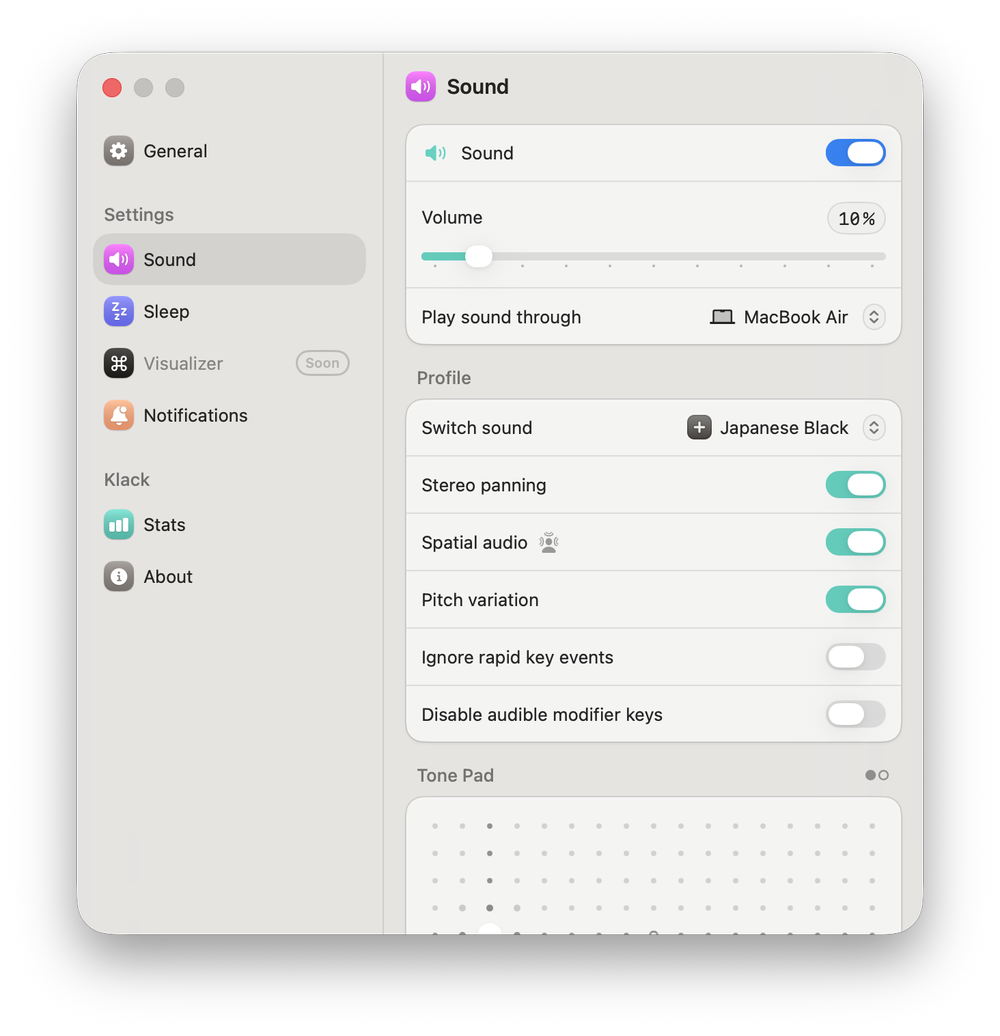
Adjust an absolutely ridiculous number of settings to create your perfect Klack profile, from volume and switch sounds to the overall tone.
Each switch set includes over 100 audio files, delivered with zero latency, with support for Spatial Audio so the sound changes based on your head position when using headphones. It also offers variable pitches and plenty of customization, letting you adjust the tone, pitch variation, and volume to create the perfect keystroke profile for you.
You can also customize exactly when you want those keystroke sounds to occur. So if you’re in meetings, listening to music, on camera, or winding down in the evening and don’t want the extra clicks and clacks, you can set specific cues that automatically disable the app in those situations. All of this is easily adjustable through the applications beautifully designed setting panel.
I love typing on Apple’s Magic Keyboard, and while I’ve tried a small handful of mechanical keyboards over the years, I keep coming back to it. But one drawback of Apple’s keyboards is that they don’t sound satisfying at all. Klack changes that. After a couple days of using it, I’m hooked! I honestly can’t see myself turning it off anytime soon.
Klack is available from the developer Henrik Ruscon on his website or through the Mac App Store for $4.99.
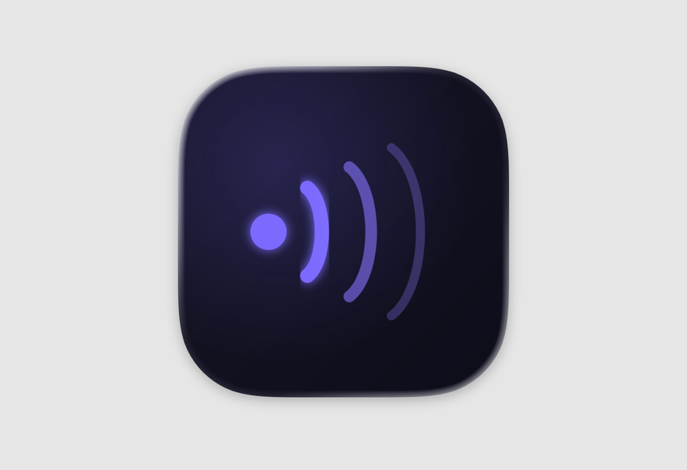
Double your WPM with this offline, privacy-minded dictation app.
I spend a lot of time typing. I write case notes at work, I write for this blog, and I journal at home. And between all that I am responding to emails, sending messages, grading papers, making notes. And despite all that typing, I am a very average typist, usually landing somewhere between 48–58 words per minute with about a 5% error rate. What I began to notice is that I had more to write that I wanted to type, and that’s where Unspoken came in.
Unspoken is an offline dictation app that uses local AI models to help you quickly dictate your messages. Apple already has its own speech recognition built into its devices, but I’ve found that other models are often more reliable and accurate at understanding what I’m trying to say.
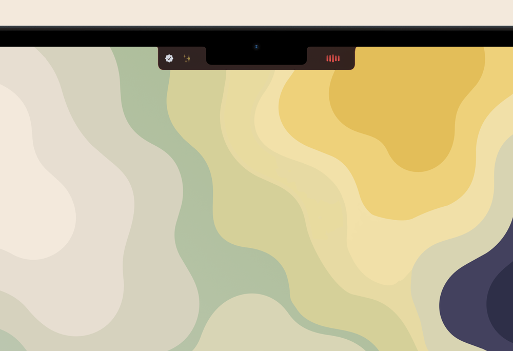
The Unspoken recording indicator, tucked neatly into the notch.
That accuracy is what makes dictation like this feel genuinely useful. It doesn’t just help me get my thoughts out faster, it also saves me time afterward because I can trust that what I’m saying is being captured and transcribed properly.
And over the past few months, I’ve found the accuracy of good dictation invaluable for helping me write in a way that captures my voice and tone, which I have found especially beneficial for helping make my emails, journal, and feedback to students more personal.
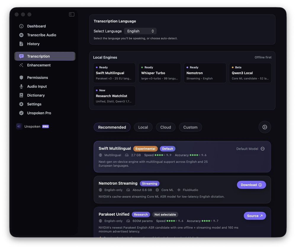
Settings window allowing you to choose from a range of offline and cloud models.
Unspoken now features over a dozen local models to download, each varying in language support, file size, speed, and accuracy. You can also add text snippets for quick entry, create a custom dictionary to improve transcription accuracy, and enable automatic formatting, punctuation, and speech refinement, helping smooth out the umms, stutters, and awkward pauses that naturally show up when speaking.
You can also pair it with an online LLM to improve context awareness and add another layer of refinement. But for me, one of the app’s biggest selling points is that all of the processing can happen privately on device.
One small complaint I have with the app is that it doesn’t show the text you’re speaking until after you end the transcription. So if you’re dictating longer passages, you’re a bit blind to what you’ve already said. It’s mildly annoying at first, but honestly, you adjust pretty quickly, and before long it mostly fades into the background.
Overall, using Unspoken has increased my words per minute to nearly 90, nearly doubling my previous writing speed. It can feel a bit strange at first, mostly because the way I write is different from the way I speak, but learning to adjust my thinking has been worth it. The speed and convenience gains have been significant.
Unspoken is available as a $8/month ($80/year) subscription or as a $190 one-time purchase.