2026-07-13 06:00:00
2026-07-13 05:41:36
We're just over halfway through 2026, and by my count, I've see 15 2026 releases so far. Here's a from-the-hip ranking what I liked the most to least.
2026-07-10 07:00:00
Lucas Shaw: Netflix Viewers Are Abandoning Shows After One Season
One Piece, one of Netflix’s most-watched shows of 2023, lost more than 30% of its audience for the second season. Season two of Beef suffered a drop of more than 70%. The Night Agent shed 50% of its audience for the second season and another 35% for its third season. These figures are all through the first four weeks of a show’s release and come straight from Netflix. Adding insult to injury, the latest season of Avatar: The Last Airbender, one of Netflix’s most-watched titles in 2024,suffered a drop of more than 60% over week one. That doesn’t bode well for the rest of the month.
I think there's something timeless about traditional TV releases. Netflix shocked the industry when they released the first season of House of Cards all at once, but many years later, it sure seems like the weekly release cadence has much more power. The novelty of getting a whole season at once was fun, but I think it turns out going back to the same show week after week is actually something we enjoyed more than we realized.
I think there's something special about watching a TV season over a few months. I think about the spring of 2025 as the spring where I enjoyed seeing Jason Mantzoukas on Taskmaster. I'll remember mid-2026 as when I watched Widow's Bay or The Pitt. Not only did these shows occupy my attention for longer periods of time, they also got to have a whole ecosystem develop around them. Reaction podcasts and online theorizing all happened as we watched the same thing every week and got to think about it for more than 5 seconds before the next episode auto-played. I'm just saying, cliffhangers work a lot better when you have to sit on them for a while.
Is this why Netflix really struggles to get people to watch past the first season? I don't know. What I do know is that people develop relationships with shows that strengthen as they go on. It's worth noting how weird it is for the first season of a show to be its highest rated. Most shows build an audience over the first few seasons, with seasons three and four really hitting their stride, both artistically and viewer count. Netflix definitely makes some trash, but they also make a lot of good shows as well, and those good shows are also seeing massive audience drops. This isn't some sort of scientific data I'm bringing to the table, but I do think there's something to the idea that the way Netflix distributes their shows, people don't build up a strong relationship with them, so they don't stick with them after the initial novelty of season 1.
2026-07-10 06:20:00
From Asha Sharma's letter to Xbox employees earlier this week (via IGN):
To grow, we bet on Game Pass, multi-platform, and a broader portfolio of content. While those businesses have created meaningful value, they did not grow at the pace we expected. As that happened, our core business weakened, and we added more teams, more investment, and more time, hoping for a better outcome. And now the industry is facing the most severe hardware crisis in its history. We must reset XBOX.
As someone who has been critical of Xbox's strategy, management of studios, and Game Pass at a very fundamental level for many years, there's of course a bit of satisfaction with seeing the head of Xbox agree with all those points. But it's cold comfort for how they're handling the situation now, which I think shows a lack of respect for the medium.
I'm sure I'll write more about this later, but for now, here's an excerpt from the latest Digital Foundry podcast with John Linneman talking about how part of these 3,200 job cuts were effectively gutting the game engine developers at id Software (for reference, gutting the engine development team at id is like gutting the industrial design team at Apple. Okay, you can do that to save money temporarily, but you're cutting the core of what makes them great).
This is the worst thing Xbox has ever done for me personally and a direct insult to the medium and it shows the leadership knows nothing and cares nothing about the industry. They are here to make money exclusively, and they will do it by any means necessary. And I can see why. If you look at the Excel sheet or you ask Copilot, be like, oh, Id Software releases one game every like 4 or 5 years and they have this big custom engine. Why? You know, so let's just cut all that and spend less money and be done with it, you know, either they support studio. I doubt it.
They just make things differently. I just don't understand how even they could achieve that. They said they want to keep the IP. They want more Doom and Wolfenstein, whatever games, but they want it more often and they want to leverage that IP, but you cut half the studio. Who the hell is going to make this rich? Who's going to make this? What's the point? Like, what are they even doing?
2026-07-10 04:00:00
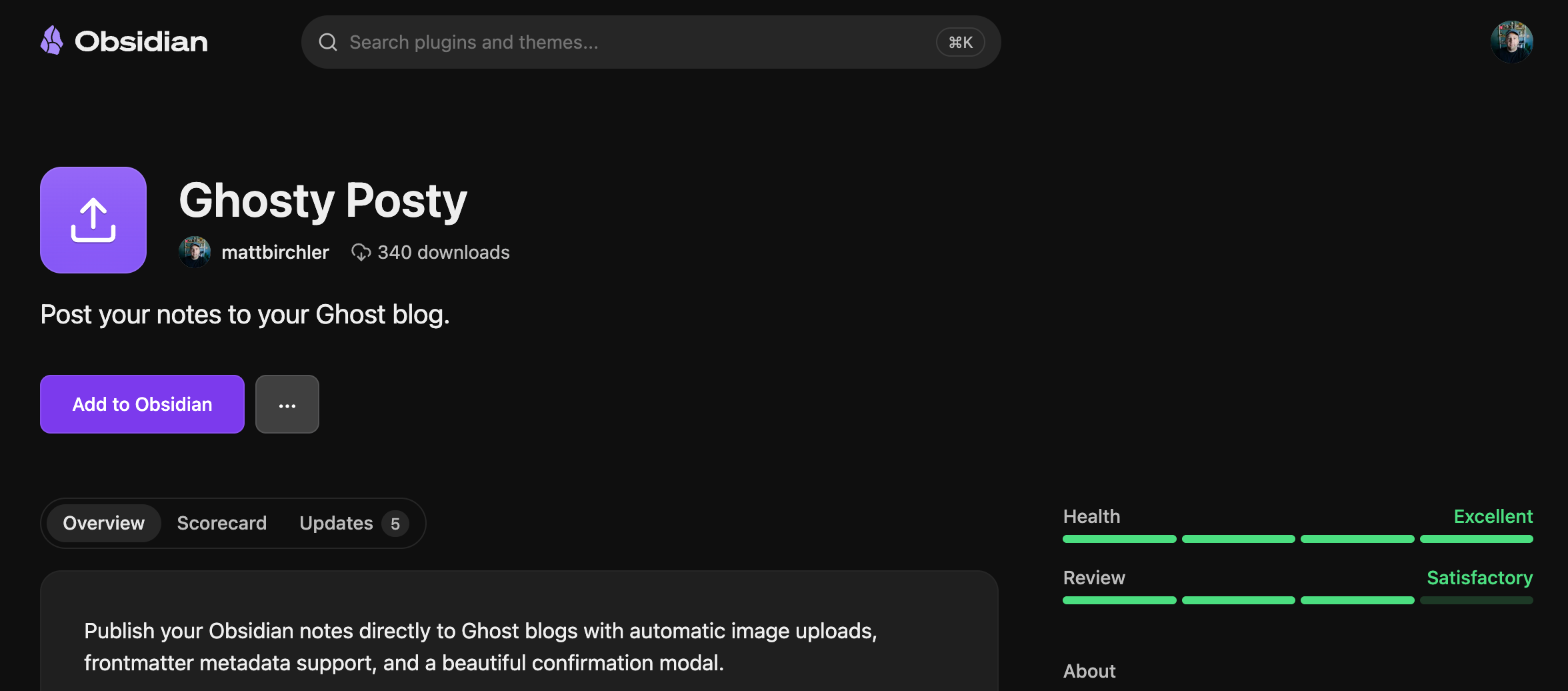
Ghosty Posty is my Obsidian plugin that lets you writing Obsidian and publish direct to your Ghost blog. In my humble (if biased) opinion, it is by far the best way to publish to Ghost from Obsidian. Here's what's new in today's 1.1 update.
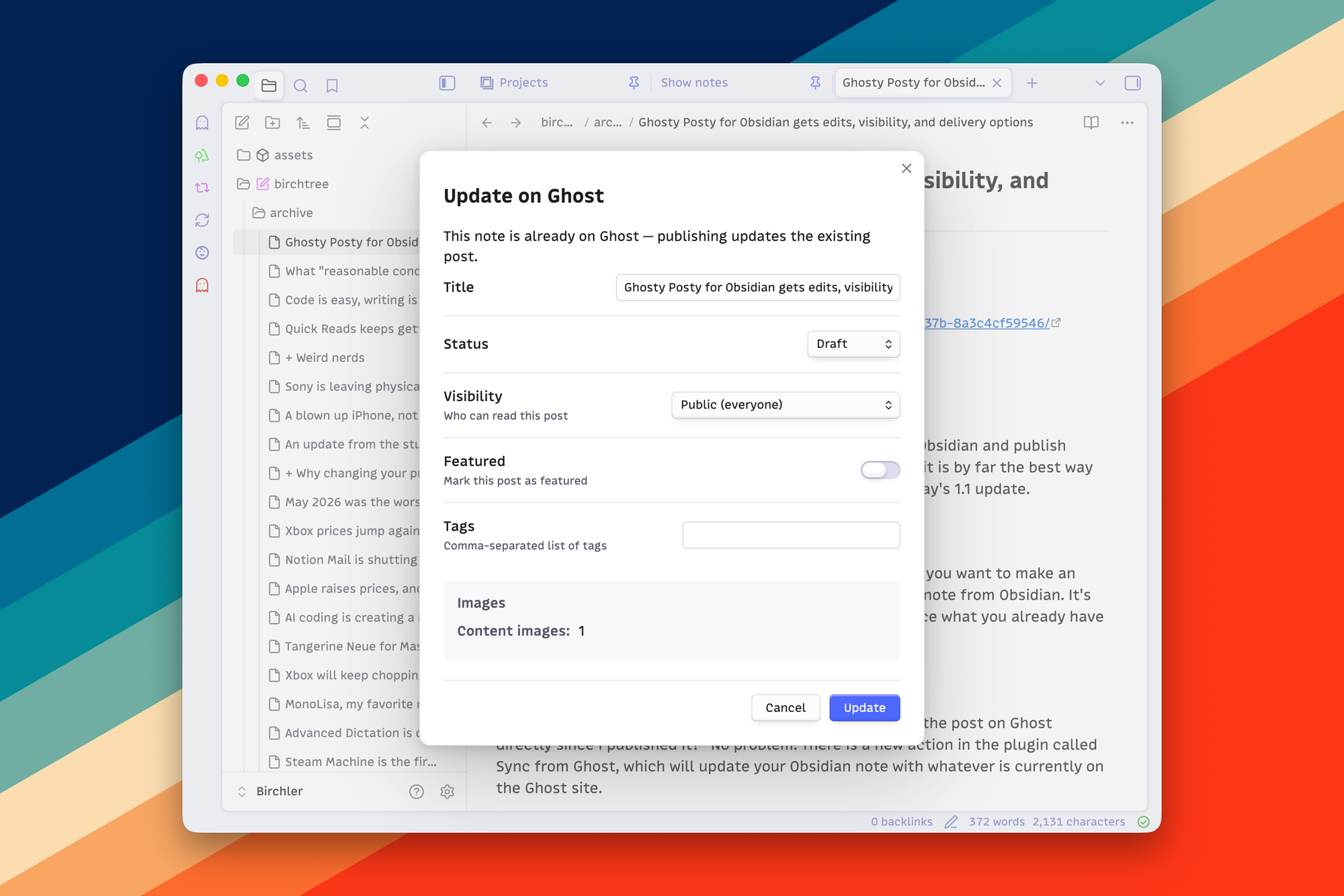
After posting, the Ghost post ID is saved to the note, and if you want to make an edit to that post later, you can simply republish that same note from Obsidian. It's linked up to the proper post on Ghost and will simply replace what you already have there.
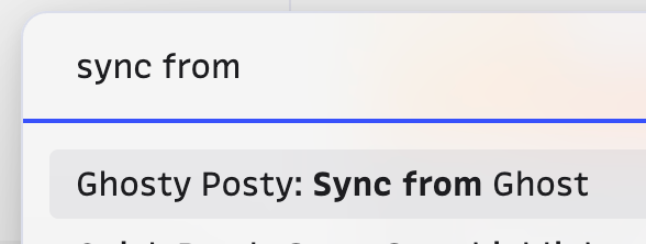
Now you may be wondering, "what happens if I have edited the post on Ghost directly since I published it?" No problem. There is a new action in the plugin called Sync from Ghost, which will update your Obsidian note with whatever is currently on the Ghost site.
To be clear, this does not pull in your full Ghost blog into Obsidian. This will only work for notes that you published via this plugin.
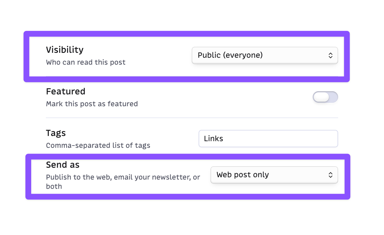
Previously, the plugin only allowed you to post articles to your blog, not to send newsletters. Now you have the option to do a simple post, to send an email, or to do both.
If you have membership active on your Ghost site, Ghostie Postie will recognize that and give you the ability to choose the visibility for each post, whether it be for everyone, all members, or just paid members.
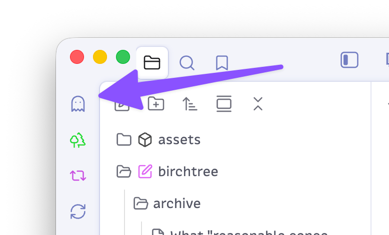
I've been using the plugin called Commander to add Ghosty Posty to my ribbon since the beginning, so I hadn't really noticed that I'd neglected to add official support for it. Now Ghostie Postie will show up in the ribbon without the need to install another plugin.
That said, I think Commander is awesome and it lets you add basically anything you want to the ribbon, so check it out as well if you haven't already.
As always, Ghosty Posty is completely free, and if you write in Obsidian and publish to Ghost, I think it's an absolute no-brainer.
2026-07-09 20:00:00
Parker Molloy wrote what I think is a must read article that has too many quotes I'd like to make, so just go read it: Reasonable Concerns.
Terry Schilling runs the American Principles Project, one of the outfits that spent years writing and bankrolling bills like the ones the court just upheld. In early 2023, he told the New York Times what the group was really after. Its goal, he confirmed, was to do away with transition care entirely, for adults as much as for kids. Starting with kids was just, in his words, “going where the consensus is.”
There's quite a bit here to help people understand why the "trans women in sports" issue is not really about sports, it's about getting a wedge in somewhere so they can take one right away, then another, then another, with the ultimate goal of making these people's mere existence illegal. Don't take our word for it, just take Terry Schilling and people like him at his word that this is literally what they're doing.
Also, if you are a man who claims to be concerned with women's sports, I think you should be legally required to turn over your YouTube history to see how many "male athlete embarrasses female athlete" videos they've watched.