2026-06-30 01:17:15
See visuals like this from many other data creators on our Voronoi app. Download it for free on iOS or Android and discover incredible data-driven charts from a variety of trusted sources.
For more than two decades, central banks have gradually diversified their reserve portfolios. While the U.S. dollar remains the world’s dominant reserve asset, its share has steadily declined as countries have added gold and a broader mix of currencies.
This visualization tracks how global official reserves have changed between 2000 and 2025. It shows that gold has been the biggest winner of this shift, climbing to nearly one-quarter of total reserves even as no single currency has come close to replacing the dollar.
The data comes from the IMF’s Currency Composition of Official Foreign Exchange Reserves (COFER) database and International Liquidity (IL) dataset.
The U.S. dollar accounted for nearly 59% of global reserves in 2000, compared with just under 40% by the end of 2025.
| Central Bank Reserve Assets | 2000 | 2025 | Change |
|---|---|---|---|
| Gold | 11.4% | 24.5% | +13.0 pts |
| U.S. dollar | 58.7% | 39.6% | -19.1 pts |
| Euro | 14.8% | 14.1% | -0.7 pts |
| Yen | 5.5% | 4.0% | -1.5 pts |
| Pound | 2.9% | 3.1% | +0.2 pts |
| Renminbi | — | 1.4% | +1.4 pts |
| Other | 6.8% | 13.4% | +6.7 pts |
Although no other currency has come close to replacing it individually, central banks have steadily diversified their reserve portfolios over time.
The euro remains the second-largest reserve currency, while the Japanese yen, British pound, and Chinese renminbi together account for a relatively modest share.
Gold’s share of global reserves has more than doubled since the early 2000s, reaching 24.5% in 2025.
Unlike reserve currencies, gold carries no sovereign issuer and cannot be frozen or sanctioned by another government, making it increasingly attractive in an era of geopolitical uncertainty.
The sharp rise during 2024 and 2025 reflects both strong central bank purchases and higher gold prices, which increased the value of existing holdings.
As geopolitical fragmentation continues, reserve diversification is likely to remain a defining theme for central banks worldwide.
If you enjoyed today’s post, check out Mapped: How Major Currency Performance Shifted in 2025 on Voronoi.
2026-06-29 23:48:00

The highest-paying college degrees can shape a graduate’s earning potential for decades. While factors like industry, location, and experience influence salaries, some majors consistently lead to higher pay than others.
This visualization, created in partnership with Terzo as part of the Markets in a Minute series, ranks America’s highest paying college degrees based on median mid-career wages. The data comes from the New York Fed and highlights which majors deliver the strongest long-term earning potential in 2024.
Engineering majors claim many of the top spots in the rankings. Chemical engineering leads the list with a median mid-career wage of $135k. Computer engineering and aerospace engineering follow close behind at $131k and $130k, respectively.
| Rank | Major | Mid-Career Median Wage ($k) |
|---|---|---|
| 1 | Chemical Engineering | 135 |
| 2 | Computer Engineering | 131 |
| 3 | Aerospace Engineering | 130 |
| 4 | Electrical Engineering | 123 |
| 5 | Computer Science | 120 |
| 6 | Mechanical Engineering | 120 |
| 7 | Construction Services | 120 |
| 8 | Civil Engineering | 115 |
| 9 | Economics | 115 |
| 10 | Finance | 112 |
| 11 | Business Analytics | 109 |
| 12 | General Engineering | 105 |
| 13 | Misc Engineering | 105 |
| 14 | Physics | 105 |
| 15 | Engineering Technologies | 104 |
| 16 | Info Systems & Mgmt | 100 |
| 17 | Industrial Engineering | 100 |
| 18 | Biochemistry | 100 |
| 19 | Mathematics | 100 |
| 20 | Political Science | 100 |
Electrical engineering, mechanical engineering, and civil engineering also rank among the highest paying college degrees. These fields benefit from sustained demand across manufacturing, infrastructure, energy, and advanced technology industries.
Engineers also earn some of the highest salaries immediately after graduation. Recent graduates typically make between $75k and $90k annually, giving many engineering majors a strong head start.
Technology-focused majors also offer impressive returns. Computer science ranks fifth overall, with a median mid-career wage of $120k.
Information systems and management also appears among the top-paying degrees. As companies invest in artificial intelligence, automation, and digital transformation, graduates with technical skills remain in high demand.
Not all of the highest paying college degrees fall within engineering or technology. Economics ranks ninth, with a median mid-career wage of $115k. Finance follows at $112k, while business analytics reaches $109k.
Several science majors also make the list. Physics, biochemistry, and mathematics each deliver median mid-career wages of $100k or more. These disciplines provide analytical and quantitative skills that employers value across many industries.
Compensation remains one of the largest expenses for most organizations. Understanding which degrees command the highest wages can help CFOs benchmark talent costs, identify skills shortages, and plan future workforce investments.
In a market where success increasingly depends on maximizing existing assets, contract data has become an important source of untapped value. NirvanAI helps businesses unlock insights hidden within their contracts, turning complex data into actionable intelligence. For CFOs, that means faster decisions, lower risk, and a clearer view of opportunities across the organization.
Learn how Terzo’s NirvanAI can help your company save money by turning contract PDFs into structured, actionable insights.


Amazon ends Walmart’s 13-year reign at the top, reshaping the 2026 leaderboard of the biggest U.S. companies by revenue.


See which highest grossing summer movies ruled the box office since 2010, and why only one original film reached No. 1.


U.S. trade is being reshaped by AI demand, tariffs, and companies shifting toward alternative manufacturing hubs.


Luxury housing prices climbed in 2025, led by Tokyo’s nearly 60% jump. See which global cities saw the fastest growth.


See how GDP per capita varies widely across U.S. states, from under $60K in Mississippi to nearly $280K in Washington, D.C.


Which major economies are set to grow the fastest in 2026? Explore GDP growth projections for the world’s 20 largest countries.


See the top-performing currencies against the U.S. dollar and what’s driving their gains, from strong foreign investment to interest rates.


At an estimated $417 billion in total value today, the sports market continues to expand rapidly. What are the top revenue streams?


Startup ecosystems are emerging around the world, but a small group of countries continues to lead the charge.


Wholesale turkey prices have gone up a whopping 70%. Where else are businesses being hit by high inflation?


Top CFOs are earnings thousands per hour in compensation. Who’s leading the pack, and how much are they making?


This visualization breaks down the U.S. $13.4 trillion ETF market by asset class, showing how ETFs allocate capital across equities, bonds, and more.


Which country led stock markets in 2025? See the biggest shocks, rebounds, and year-end returns in this global recap.


Which global cities are most at risk of a housing bubble? This new map ranks the world’s most overheated real estate markets.


Want AI your team will trust? Pull back the curtain on the top factors that make people believe in artificial intelligence.


Find out how common AI hallucination is for leading models, and what that means for the businesses that rely on them.


Among the dangers of AI, one stands apart as causing trouble for almost a third of companies. What do leaders need to know?


Which university has had the most alumni become entrepreneurs in the last decade? Hint: its not Stanford or Harvard.


In many advanced economies, the number of retirees is climbing while the working-age population shrinks. What are the countries where workers are supporting the most seniors?
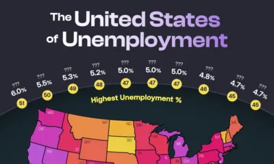

The national unemployment rate for the U.S. rose to 4.3% in August 2025. But that figure masks vast differences in local labor market health across states.


A trade war has threatened economic ties in 2025. Which economies are most exposed to these shifts in international trade?


Tariff rates vary by country, as does the value of goods each nation exports to the U.S. Which countries contribute the most?


As the U.S. labor market cools, which industries are still hiring—and which are cutting back their workforces?


Global debt continues to climb, reaching $150T in Q1 2025. Which countries carry the heaviest burdens?
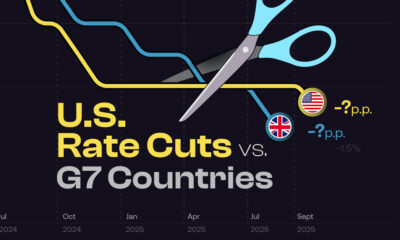

How do Fed rate cuts in the U.S. compare with the interest rate changes in other G7 countries, and what does it mean for business?
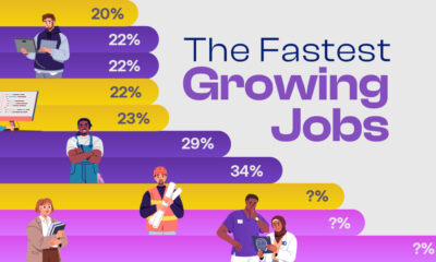

Explore the fastest growing jobs by projected growth rate, plus salary insights, in a rapidly changing job market.


This graphic pieces together the $127T global stock market to reveal which countries and regions dominate—and how much equity they control.


The median age of first-time home buyers has reached a historic high. See just how long it’s taking people to get on the property ladder.


The Silent Generation’s share of real estate has dropped dramatically as people age, but how have Baby Boomers, Gen X, and Millennials fared?


Real estate is the biggest industry by GDP in 26 states. Find out why it dominates—and what fuels the rest of the country.
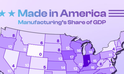

Tariffs are rising to boost American-made goods. Which states gain the most—and least—from manufacturing today?


Collectively, the ten most profitable U.S. companies have a net income of $684 billion—more than the entire GDP of Belgium.


New York City has the highest millionaire population globally. Which other cities attract the world’s wealthiest?
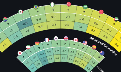

The global economy is expected to have slighter slower growth going forward. Which countries are on track to have the biggest GDP increases?
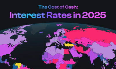

The U.S. has kept their target rate the same at 4.25-4.50%. What do interest rates look like in other countries amid economic uncertainty?
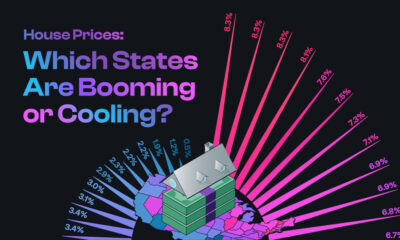

The national housing market saw a 4.5% rise in house prices. This graphic reveals which states had high price growth, and which didn’t.


If you held a $1,000 investment from 1975-2024, this chart shows how the inflation rate can drastically reduce the value of your money.


Trump cites trade deficits—the U.S. importing more than it exports—as one reason for tariffs. Which countries represent the largest deficits?
2026-06-29 22:08:57
See visuals like this from many other data creators on our Voronoi app. Download it for free on iOS or Android and discover incredible data-driven charts from a variety of trusted sources.
Where is capital best protected in an increasingly uncertain world?
This ranking from Henley & Partners scores 50 countries based on their ability to withstand economic and geopolitical shocks, measuring factors like political stability, inflation, governance, public finances, and currency risk rather than expected investment returns.
Switzerland ranks first with a score of 88.4 out of 100, followed by Denmark and Norway.
Europe dominates the list overall, accounting for nine of the top 10 countries. Singapore is the lone exception, placing fourth thanks to its strong governance, sound public finances, and highly competitive business environment.
| Rank | Country | Global Investment Risk and Resilience Score 2026 |
|---|---|---|
| 1 |
 Switzerland Switzerland |
88.4 |
| 2 |
 Denmark Denmark |
85.1 |
| 3 |
 Norway Norway |
83.5 |
| 4 |
 Singapore Singapore |
83.4 |
| 5 |
 Sweden Sweden |
83.2 |
| 6 |
 Luxembourg Luxembourg |
83.0 |
| 7 |
 Finland Finland |
82.1 |
| 8 |
 Netherlands Netherlands |
80.8 |
| 9 |
 Germany Germany |
80.7 |
| 10 |
 Iceland Iceland |
79.8 |
| 11 |
 Canada Canada |
78.5 |
| 12 |
 Austria Austria |
78.5 |
| 13 |
 Estonia Estonia |
78.4 |
| 14 |
 Czechia Czechia |
78.0 |
| 15 |
 Ireland Ireland |
77.9 |
| 16 |
 New Zealand New Zealand |
77.8 |
| 17 |
 Hong Kong SAR Hong Kong SAR |
76.5 |
| 18 |
 Slovenia Slovenia |
75.7 |
| 19 |
 UK UK |
75.2 |
| 20 |
 South Korea South Korea |
74.8 |
| 21 |
 Belgium Belgium |
74.4 |
| 22 |
 Lithuania Lithuania |
74.4 |
| 23 |
 France France |
74.2 |
| 24 |
 U.S. U.S. |
73.0 |
| 25 |
 Brunei Brunei |
73.0 |
| 26 |
 Latvia Latvia |
72.9 |
| 27 |
 Japan Japan |
71.7 |
| 28 |
 Malta Malta |
71.5 |
| 29 |
 UAE UAE |
71.3 |
| 30 |
 Slovakia Slovakia |
70.7 |
| 31 |
 Croatia Croatia |
69.8 |
| 32 |
 Australia Australia |
69.6 |
| 33 |
 Poland Poland |
69.5 |
| 34 |
 Uruguay Uruguay |
69.3 |
| 35 |
 Israel Israel |
69.1 |
| 36 |
 Italy Italy |
68.6 |
| 37 |
 China China |
68.5 |
| 38 |
 Qatar Qatar |
68.1 |
| 39 |
 Georgia Georgia |
68.0 |
| 40 |
 Bulgaria Bulgaria |
67.9 |
| 41 |
 Malaysia Malaysia |
67.4 |
| 42 |
 Hungary Hungary |
67.4 |
| 43 |
 Chile Chile |
67.1 |
| 44 |
 Saudi Arabia Saudi Arabia |
67.0 |
| 45 |
 Kuwait Kuwait |
66.5 |
| 46 |
 Spain Spain |
66.4 |
| 47 |
 Cyprus Cyprus |
66.1 |
| 48 |
 Portugal Portugal |
65.2 |
| 49 |
 North Macedonia North Macedonia |
65.0 |
| 50 |
 Panama Panama |
64.8 |
A clear pattern emerges from the rankings: countries with stable political institutions, disciplined public finances, and credible monetary policy consistently outperform larger economies facing higher political or economic uncertainty.
The index suggests that resilience—not market size—is the defining characteristic of today’s safest investment destinations.
The U.S. ranking highlights one of the index’s biggest distinctions. Rather than rewarding economic size alone, the methodology also accounts for political stability, fiscal strength, inflation, currency volatility, and governance.
As a result, smaller economies such as Switzerland, Denmark, and Singapore rank ahead of much larger investment markets.
Importantly, the index is not designed to predict which stock markets will generate the highest returns.
Instead, it evaluates how resilient each country’s overall investment environment is during periods of economic and geopolitical stress by assessing 13 indicators, including inflation, currency volatility, governance, political stability, and public finances.
The result is a broader view of investment safety, focusing less on market performance and more on a country’s ability to remain stable during periods of global stress.
To learn more about this topic, check out this graphic showing the countries with the best reputations.
2026-06-29 20:04:52
See visuals like this from many other data creators on our Voronoi app. Download it for free on iOS or Android and discover incredible data-driven charts from a variety of trusted sources.
Americans don’t all work the same schedule. Depending on where they live, the average private-sector workweek differs by nearly four hours, reflecting the industries that dominate each state’s economy.
This map shows average weekly hours worked across every U.S. state and the District of Columbia using data from the U.S. Bureau of Labor Statistics for April 2026.
Louisiana tops the ranking with an average private-sector workweek of 36.3 hours, followed by Texas and Alabama.
| Rank | State | Average Weekly Hours Worked |
|---|---|---|
| 1 | Louisiana | 36.3 |
| 2 | Texas | 35.9 |
| 3 | Alabama | 35.8 |
| 4 | District of Columbia | 35.4 |
| 5 | Alaska | 35.3 |
| 5 | West Virginia | 35.3 |
| 7 | Mississippi | 35.2 |
| 8 | Arkansas | 35.1 |
| 8 | Kentucky | 35.1 |
| 8 | Oklahoma | 35.1 |
| 11 | Georgia | 34.9 |
| 11 | North Dakota | 34.9 |
| 11 | Wyoming | 34.9 |
| 14 | Nevada | 34.7 |
| 14 | Tennessee | 34.7 |
| 16 | Washington | 34.5 |
| 17 | Idaho | 34.4 |
| 17 | Pennsylvania | 34.4 |
| 19 | Florida | 34.2 |
| 19 | North Carolina | 34.2 |
| 21 | New Mexico | 34.1 |
| 21 | Ohio | 34.1 |
| 23 | Arizona | 33.9 |
| 23 | Iowa | 33.9 |
| 23 | Virginia | 33.9 |
| 26 | Michigan | 33.8 |
| 26 | New Jersey | 33.8 |
| 26 | South Carolina | 33.8 |
| 29 | Indiana | 33.7 |
| 30 | Kansas | 33.6 |
| 30 | Nebraska | 33.6 |
| 30 | Vermont | 33.6 |
| 33 | Connecticut | 33.5 |
| 34 | Illinois | 33.4 |
| 34 | Maryland | 33.4 |
| 36 | Rhode Island | 33.3 |
| 37 | Montana | 33.1 |
| 37 | Utah | 33.1 |
| 39 | Massachusetts | 33 |
| 40 | Colorado | 32.9 |
| 40 | Missouri | 32.9 |
| 40 | New Hampshire | 32.9 |
| 40 | New York | 32.9 |
| 40 | Oregon | 32.9 |
| 40 | Wisconsin | 32.9 |
| 46 | California | 32.8 |
| 47 | Maine | 32.7 |
| 47 | Minnesota | 32.7 |
| 49 | South Dakota | 32.6 |
| 50 | Hawaii | 32.5 |
| 51 | Delaware | 32.4 |
A clear regional pattern emerges from the rankings.
States with large oil and gas industries, manufacturing bases, or resource extraction sectors generally report longer average workweeks, reflecting industries that rely on continuous operations, shift work, and longer full-time schedules.
By contrast, states with larger concentrations of professional services, finance, education, healthcare, or tourism generally report shorter average workweeks. These industries often have more standardized schedules and a greater share of salaried office-based employment.
California, New York, Massachusetts, and Hawaii all fall below the national leaders despite their large economies.
The figures reflect average hours worked rather than worker productivity or earnings, highlighting how different industries organize labor.
The spread between the highest- and lowest-ranked jurisdictions is relatively modest, at just under four hours per week.
However, over the course of a year, that difference amounts to nearly 200 additional hours worked, roughly the equivalent of five extra full-time workweeks.
If you enjoyed today’s post, check out The States Where Housing Prices Have Surged the Most (2021–2026) on Voronoi.
2026-06-29 17:29:08
This was originally posted on our Voronoi app. Download the app for free on iOS or Android and discover incredible data-driven charts from a variety of trusted sources.
Across most of the world, men and women are present in nearly equal numbers. Yet in a handful of countries and territories, women make up well over half the population, creating some of the world’s largest gender imbalances.
This visualization, created by Harris Saleem, ranks the countries and territories with the highest female share of the population using the latest available World Bank data. Longer female life expectancy is a major factor, but migration and age structure also shape these demographic patterns.
Hong Kong leads the ranking, with women accounting for 54.9% of the population. Moldova, Macao, Latvia, and Armenia round out the top five, each with female population shares above 53%.
| Rank | Country | Percentage Female Population |
|---|---|---|
| 1 |
Hong Kong |
54.9% |
| 2 |
 Moldova Moldova |
54.0% |
| 3 |
 Macao Macao |
53.9% |
| 4 |
Latvia |
53.7% |
| 5 |
 Armenia Armenia |
53.6% |
| 6 |
 Russia Russia |
53.6% |
| 7 |
 Ukraine Ukraine |
53.5% |
| 8 |
Georgia |
53.4% |
| 9 |
 Belarus Belarus |
53.4% |
| 10 |
 Puerto Rico Puerto Rico |
52.9% |
| 11 |
Lithuania |
52.8% |
| 12 |
 Aruba Aruba |
52.8% |
| 13 |
 Tonga Tonga |
52.6% |
| 14 |
 Serbia Serbia |
52.5% |
| 15 |
Estonia |
52.5% |
Many countries on the list are in Eastern Europe or are island territories, where aging, migration, and historical mortality patterns can all have an outsized effect on the population mix.
Although the differences may appear small, they are significant at the national level. A female share above 53% can represent hundreds of thousands, and in larger countries millions, more women than men.
In many developed economies, the answer often comes down to longer life expectancy. Women tend to outlive men globally due to biological advantages and lower exposure to certain high-risk behaviors and occupations. As populations age, this longevity gap becomes more visible.
Healthcare improvements also play a role. While better medical care has increased life expectancy for both sexes, women generally retain a longevity advantage that becomes more pronounced in older populations.
Migration can also reshape gender balances. In some countries, working-age men leave for jobs abroad, increasing the share of women who remain. In others, male-dominated immigration has the opposite effect.
Not every country skews female. Some Gulf states, including Qatar and the United Arab Emirates, have large male immigrant workforces, pushing their populations heavily male.
Meanwhile, parts of South Asia and China have historically seen male-skewed populations, partly reflecting son preference and imbalanced sex ratios at birth. National gender ratios are ultimately shaped by a combination of health, aging, migration, and social factors.
To compare the other side of the demographic divide, check out Countries With the Highest Percentage of Male Population.
2026-06-29 17:28:58
This was originally posted on our Voronoi app. Download the app for free on iOS or Android and discover incredible data-driven charts from a variety of trusted sources.
Most countries have populations that are split close to evenly between men and women.
But a handful stand far apart from the global norm. In Qatar, nearly three out of every four residents are men, while several neighboring Gulf economies also have unusually high male shares driven largely by labor migration.
This visualization, created by Harris Saleem, ranks countries by the male share of their total population, using the latest available data from the World Bank.
At the top of the ranking is Qatar, with a 72% male share. The United Arab Emirates follows at about 64%, with Oman, Bahrain, Kuwait, and Saudi Arabia also standing well above the global norm.
Here are the countries with the highest percentage of male population:
| Rank | Country | Percentage Male Population |
|---|---|---|
| 1 |
Qatar |
72% |
| 2 |
U.A.E |
64% |
| 3 |
 Maldives Maldives |
62% |
| 4 |
 Oman Oman |
62% |
| 5 |
 Bahrain Bahrain |
62% |
| 6 |
Kuwait |
61% |
| 7 |
Saudi Arabia |
61% |
| 8 |
 Seychelles Seychelles |
55% |
| 9 |
 Palau Palau |
54% |
| 10 |
 Bhutan Bhutan |
53% |
| 11 |
Brunei Darussalam |
53% |
| 12 |
 Equatorial Guinea Equatorial Guinea |
53% |
| 13 |
 Greenland Greenland |
53% |
| 14 |
Malaysia |
52% |
| 15 |
Malta |
52% |
These countries are major outliers compared with most of the world, where the male and female shares typically sit close to 50/50.
The biggest factor is labor migration. Countries with large construction, energy, services, and infrastructure sectors often attract vast numbers of foreign workers, many of whom are men.
This can dramatically skew the population balance, especially in smaller countries where migrant labor makes up a large share of residents.
Gulf economies like Qatar dominate the top of the list, while countries like Bhutan, Equatorial Guinea, India, and Papua New Guinea show more moderate male majorities.
Even without migration, populations tend to begin with a slight male bias. Biologically, around 105 boys are born for every 100 girls, according to research by the BBC and Our World in Data.
In some Asian countries, this imbalance can be amplified by sex-selective practices and cultural preferences for male heirs. These dynamics are one reason broader conversations around the global gender gap often include demographic patterns alongside economic and social indicators.
A high male population share is a population imbalance that does not have a single explanation. In Gulf states, it is largely tied to migration and labor demand. Elsewhere, birth ratios, cultural preferences, life expectancy, and migration patterns can all influence the balance.
To compare the other side of the demographic divide, check out Countries With The Highest Percentage Of Female Population.